Build a Smarter Quarterly Reporting Template

Let’s be honest: a static, copy-paste quarterly reporting template just doesn't cut it anymore. It's an outdated approach that often creates more headaches than it solves. What you really need is a dynamic, well-built template that can transform a sea of raw numbers into a clear, compelling financial story. This is how you build genuine stakeholder trust and keep investor confidence high.
Why Your Old Reporting Template Is Failing You
Does your team practically groan when the end of the quarter rolls around? If so, your reporting process is probably broken. The usual suspect is a rigid, hand-me-down template that forces everyone to manually wrestle with data. This not only invites errors but also eats up valuable time that should be spent on actual analysis. It turns reporting from a strategic opportunity into a dreaded chore.
A better way of thinking shifts the focus from just plugging in numbers to telling a story. Instead of just presenting data, a truly effective template helps you explain the why behind the figures. It creates a standardized framework that guarantees consistency and accuracy, making your report the single source of truth for everyone involved.
Spending too much time on Excel?
Elyx AI generates your formulas and automates your tasks in seconds.
Sign up →
From Box-Ticking To Strategic Insight
Quarterly reporting is so much more than a compliance task; it's a core business function. For public companies, these disclosures are a legal requirement. The U.S. Securities and Exchange Commission (SEC), for instance, mandates that over 11,000 domestic companies file a Form 10-Q every single quarter. There's even research showing that companies with consistent quarterly reporting experience an average 10% reduction in stock price volatility when earnings are announced.
But the real value isn't just for public companies. Even for private businesses, a well-structured report fosters incredible transparency and builds deep trust with investors, board members, and your own internal teams. It tells a cohesive story about your company's financial health, where the challenges lie, and the direction you're headed.
The best quarterly reports don't just list what happened. They explain what it all means for the future, turning historical data into a practical roadmap for making smarter decisions.
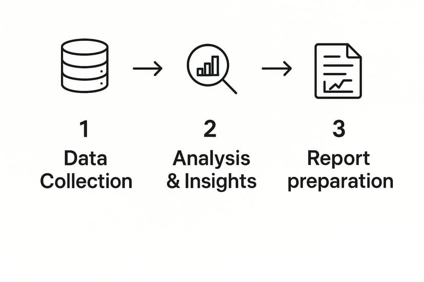
What Every Great Template Must Include
To get the full picture, your quarterly reporting template needs a solid foundation. These are the non-negotiable components that provide the depth required for meaningful analysis.
To really dig into what makes a template work, let's break down the essential pieces and why they matter. Each section serves a distinct purpose, from presenting hard numbers to adding the crucial human context.
Essential Components of a Quarterly Reporting Template
| Component | Purpose | Key Metrics Included |
|---|---|---|
| Financial Statements | Provides a comprehensive overview of the company's financial health and performance. | Income Statement, Balance Sheet, Cash Flow Statement. |
| Key Performance Indicators (KPIs) | Offers insights into operational efficiency and business-specific growth drivers. | Customer Acquisition Cost (CAC), Churn Rate, Monthly Recurring Revenue (MRR), Customer Lifetime Value (CLV). |
| Management Commentary (MD&A) | Adds context and narrative to the financial data, explaining the "why" behind the numbers. | Performance drivers, challenges faced, market trends, future outlook and strategy. |
| Variance Analysis | Compares current performance against previous periods or budget forecasts to identify trends. | Quarter-over-Quarter (QoQ) growth, Year-over-Year (YoY) growth, Budget vs. Actuals. |
By building these elements into a standardized template, you ensure every report is both comprehensive and easy to compare with previous quarters.
This kind of structured framework can completely change how you approach your periodic reviews. To see a great example in action, check out this comprehensive Quarterly Business Review Template. Ultimately, a smart template gives your team the freedom to stop chasing data and start focusing on what truly matters: analysis and strategy.
Getting Excel Ready for AI
Before we dive into building the actual quarterly report, we need to lay some groundwork in Excel. Think of it as prepping your kitchen before you start cooking—a little organization upfront saves a massive headache later. The goal here is to create a clean, logical workspace so an AI tool like Elyx.AI can easily read and understand your financial data.
First things first, you need to get the Elyx.AI add-in. You can grab it straight from Microsoft AppSource, which is always a good sign as you know it's been vetted. Once installed, it slots right into your Excel ribbon, sitting alongside the functions you already use every day. It feels like a natural part of Excel, not some bolted-on extra you have to constantly switch windows for.

How to Organize Your Raw Data for AI
Just having the tool installed won't get you very far if your data is a mess. Elyx.AI is smart, but it can't decipher a chaotic spreadsheet. It thrives on clean, structured data from your source files—things like sales logs, expense sheets, and payroll records.
The key is a simple, tabular format. This just means your data should be in clean rows and columns with clear headings.
For instance, your sales data sheet should have straightforward headers like "Date," "Product ID," "Units Sold," and "Total Revenue." Try to avoid things that can trip up the AI, like merged cells, random blank rows in the middle of your data, or cramming multiple tables onto one worksheet.
A good rule of thumb I've learned is this: if a colleague can't glance at your spreadsheet and immediately understand its layout, the AI is going to struggle, too. Clean data is the fuel for accurate, automated reporting.
I've also found it incredibly helpful to keep source data in separate, clearly named files or worksheets. For example, you might have a file named "Q2_Sales_Data.xlsx" and another called "Q2_Expenses.xlsx." This kind of organization makes it much easier to give the AI specific instructions later on, like "Summarize total revenue from the 'Sales' sheet in the Q2 Sales Data file."
Honestly, taking a few minutes to get this structure right is probably the single most important thing you can do to ensure the rest of the process is smooth sailing.
Automating Your Core Financial Statements
This is where you'll really see the magic happen. Forget wrestling with VLOOKUPs and tangled SUMIFs—we're going to use Elyx.AI to build the three pillars of your quarterly report: the Income Statement, Balance Sheet, and Cash Flow Statement. The whole idea is to shift from writing complex formulas to simply telling the AI what data you need in plain English.
Think of it this way: instead of manually linking cells and praying the connections don't break, you're creating dynamic cells that fetch data for you. When your source data gets updated, your report updates with it. Your static spreadsheet basically becomes a living document.
This is the kind of simplified workflow we're aiming for, moving from raw data to a polished report with far fewer headaches.
As you can see, automation takes over the grunt work of gathering and calculating the numbers, freeing you up for the important stuff.
Crafting the Income Statement with AI Prompts
Let’s start with the Income Statement. Say your Q2 sales figures are in a separate workbook called SalesData_Q2.xlsx. Normally, you might copy-paste or create a fragile link. With this approach, you just click the "Total Revenue" cell in your template and tell Elyx.AI what you want.
You could type something like:
"Summarize the 'Revenue' column from the 'Transactions' sheet in SalesData_Q2.xlsx."
Elyx.AI handles the rest, generating the right formula and dropping the total revenue right where you need it. You can do the exact same thing for your Cost of Goods Sold (COGS) and other operating expenses, pulling numbers from various source files with simple commands. To really grasp the impact of this, it helps to understand the key business process automation benefits that extend beyond just saving time.
Building the Balance Sheet and Cash Flow Statement
The beauty of this method is that it works just as well for the Balance Sheet and Cash Flow Statement. Need to calculate your total current liabilities? If that data is tucked away in a file named BalanceSheet_Source.xlsx, your prompt is just as straightforward:
"Calculate the sum of 'Accounts Payable' and 'Short-Term Debt' from the 'Liabilities' sheet in BalanceSheet_Source.xlsx."
This isn't just a neat trick; it's a globally recognized best practice. In the European Union, for instance, the Transparency Directive requires listed companies to file quarterly reports. It turns out that 85% of EU listed companies lean on standardized templates, and they’ve seen a 12% improvement in their investor relations survey scores as a result. Better templates lead to clearer financial communication.
By automating these core statements, you're doing more than just moving numbers around faster. You're building a reliable, error-resistant foundation for your entire report. This frees up your team to analyze the data, not just chase it down.
If you want to get deeper into the nuts and bolts, our guide on https://www.getelyxai.com/en/blog/excel-report-automation offers more advanced tips and techniques. This approach ensures your financial statements are always accurate and reflect the latest information without someone having to manually refresh everything each quarter. It fundamentally changes reporting from a reactive chore into a proactive part of your strategy.
Bringing Your Data to Life with Dynamic Visuals
Let's be honest, a spreadsheet full of raw numbers doesn't exactly get the blood pumping. While the data is crucial, it rarely tells a clear story on its own. To really understand business performance and inspire action, you need compelling visuals. This is the part where your quarterly report goes from being a static document to a dynamic, intuitive dashboard.
Instead of spending hours manually building charts, an AI tool like Elyx.AI lets you generate key performance indicators (KPIs) and visuals with simple, direct commands. You can quickly build a dashboard that gives stakeholders a clear, at-a-glance view of the company's health, highlighting critical trends without the pain of rebuilding everything every three months.

From Raw Data to Key Performance Indicators
Forget about wrestling with complex, nested formulas just to calculate your core metrics. With an AI-powered approach, you can tell Excel what you need, and it does the heavy lifting for you.
Say you want to display your Gross Profit Margin right on the dashboard. You can just select an empty cell and type a prompt in plain English.
Something like:
"Calculate Gross Profit Margin for Q2 using Total Revenue from cell C5 and COGS from cell C6 on the 'Income Statement' sheet."
Elyx.AI instantly understands this, performs the calculation (C5-C6)/C5, and drops the result right into your cell. It's that simple. You can apply this same logic to all your other essential KPIs.
- EBITDA: Prompt the AI to add up operating income, depreciation, and amortization from your financial statements.
- Customer Acquisition Cost (CAC): Instruct the AI to divide your total Q2 marketing and sales spend by the number of new customers acquired during that period.
- Churn Rate: Ask the AI to calculate the percentage of customers lost this quarter using your customer data file.
This conversational method doesn't just save a ton of time; it also dramatically reduces the chance of a simple typo in a formula throwing off your entire report.
Creating Dynamic Charts That Update Automatically
Here's where the real magic happens. Since your charts are directly linked to these AI-generated KPIs, they become truly dynamic. When you drop in the new sales and expense data for next quarter, Elyx.AI automatically refreshes the calculations. In turn, your charts and graphs update in real-time. No manual adjustments needed.
A dynamic visual dashboard isn't just a reporting tool; it's a live pulse of your business. It ensures that every stakeholder is looking at the most current, accurate representation of performance, fostering trust and enabling quicker, data-driven decisions.
Let's look at a practical comparison. Getting the same result with traditional formulas versus a natural language prompt can be a night-and-day difference in complexity. For a deeper dive into creating these kinds of visuals, our full Excel dashboard tutorial covers even more advanced techniques.
Common AI Prompts vs Traditional Excel Formulas
The table below really highlights how much simpler reporting tasks become when you can just ask for what you want instead of writing complex formulas from scratch.
| Reporting Task | Traditional Excel Formula | Elyx.AI Natural Language Prompt |
|---|---|---|
| Chart Revenue Trend | =SUMIFS(SalesData!$D:$D, SalesData!$A:$A, ">=2024-04-01", SalesData!$A:$A, "<=2024-06-30") repeated for each period. |
"Create a line chart showing monthly revenue for Q2 from the 'SalesData' sheet." |
| Visualize Expense Breakdown | Multiple SUMIF formulas for each expense category, then manually creating a pie chart. |
"Generate a pie chart breaking down expenses by category from the 'ExpenseLog' sheet for Q2." |
| Compare Regional Sales | A complex PivotTable or multiple SUMIFS formulas for each region. |
"Create a bar chart comparing total sales for the North, South, and West regions this quarter." |
By using straightforward prompts like these, you can build a sophisticated and automated quarterly reporting template where the visuals tell a clear, compelling story with almost no manual effort on your part. It’s all about working smarter, not harder.
Uncovering the Story in Your Numbers with AI
A great quarterly report does more than just present figures; it tells a story. The Management Discussion and Analysis (MD&A) section is where the raw data transforms into a narrative, explaining what happened and why. Honestly, this is usually the most draining part of the whole process. But with the right AI tools, you can get a solid first draft hammered out in just a few minutes.
Elyx.AI’s generative features let you go beyond simple sums and averages. You can ask it to interpret the data for you. This doesn’t mean your own strategic insight is no longer needed—far from it. Think of it as having a sharp-eyed analyst right there with you, connecting the dots between data points and saving you from hours of painful drafting.
From Data Points to a Compelling Narrative
The trick is to ask very specific, analytical questions. Instead of manually digging through your income statement to figure out why revenue shot up, you can just ask the AI directly inside your Excel template.
For instance, you could type a simple command like:
“Explain the primary drivers behind the 15% revenue increase this quarter, referencing the Income Statement sheet.”
Elyx.AI will dive into the data, maybe spot a big jump in a particular product line or a successful expansion into a new market, and then write up a clear summary. Just like that, you have a perfect starting point for your commentary.
This completely changes the game. Your quarterly reporting template goes from being a static collection of numbers to an active partner in your analysis. It helps you get to the 'why' behind the 'what,' which is what truly effective management commentary is all about.
How to Ask Smarter Questions for Better Insights
The insights you get from the AI are only as good as the questions you ask. To get the best results, you need to be specific.
Here are a few more prompts I’ve found to be incredibly effective:
- For digging into expenses: "Summarize the key changes in operating expenses from Q1, highlighting any significant variances."
- For explaining profitability: "Based on the data, draft a paragraph explaining the main factors that impacted our gross profit margin this quarter."
- For assessing cash flow: "Generate a brief analysis of our cash flow from operations, noting any major inflows or outflows."
This kind of automation is quickly becoming the norm for high-performing finance teams. In fact, a 2025 industry analysis revealed that companies using standardized, AI-enhanced templates cut down the time to finalize their quarterly reports by an average of 25%. It's not just about speed, either. Investors crave this kind of clarity—a whopping 78% say it's critical to their decision-making.
By building AI into your workflow, you create a more powerful and efficient quarterly reporting template. To see how this fits into the bigger picture, take a look at our complete guide on financial reporting automation. And if you're curious about where this technology is headed, you can find some great information on leveraging AI like ChatGPT-5 for UK business use cases that offers a glimpse into the future.
Got Questions About AI Reporting Templates? Let's Talk.
Switching from the old way of doing things to an AI-driven process for your quarterly reports is a big move. It’s smart to have questions. Honestly, I had a few of my own when I first started exploring this. Let's tackle some of the most common ones that come up.
The first thing on everyone's mind is always security. It should be. We're talking about sensitive financial data here.
How Secure Is My Financial Data?
This is the big one, and for good reason. Anytime you connect a tool to your financial workbooks, you need to know your data is locked down.
Reputable AI add-ins for Excel, like Elyx.AI, are built to work within Microsoft's own secure environment. That means the heavy lifting—the data processing—happens right on your computer or through encrypted channels.
Here’s the key takeaway: Elyx.AI does not store your workbook data on its servers. Your information stays private and stays with you. It’s always a good practice to check the privacy policy of any tool, but add-ins from the official Microsoft AppSource have already passed some pretty rigorous security and compliance checks.
Can I Actually Customize This for My Specific Industry?
Yes, and this is where it gets really powerful. The method of building the template is the same for everyone, but what you build is completely up to you. The true value here is how it molds to fit your world, whether you’re running a SaaS startup or a local non-profit.
Think about a non-profit. Their reporting needs are totally different from a for-profit business.
- Instead of an "Income Statement," you'd just prompt the AI to create a "Statement of Activities."
- Your KPIs would focus on things like "Program Expense Ratio" or "Fundraising Efficiency," not profit margins.
- You could use a prompt like, "Summarize total donations by source for Q2," pointing the AI directly to your donation logs.
It’s all about tailoring the report to tell the story your stakeholders need to hear.
You're not stuck with a rigid template. You’re just pointing the AI at different data and asking for different insights. The tool adapts to your reality, not the other way around.
What Happens If My Data Source Changes Next Quarter?
This is a scenario I've lived through more times than I can count. In the real world, things change. Your sales team adds a new column to their data export, or the finance department updates a naming convention.
With a traditional spreadsheet filled with complex, interconnected formulas, a tiny change like that can cause a massive headache. You spend hours hunting down broken VLOOKUPs and fixing cell references. With an AI-powered template, you simply adjust your prompt.
Instead of rewriting a monster formula, you just edit a sentence to reflect the new data structure. It's a much more resilient way to work, making your reporting process adaptable to the natural evolution of your business.
Ready to stop fighting with clunky spreadsheets and build a reporting process that's smarter and faster? Let Elyx.AI handle the grunt work. See for yourself how simple it is to create a dynamic quarterly reporting template. Learn more and install the add-in at getelyxai.com.
Reading Excel tutorials to save time?
What if an AI did the work for you?
Describe what you need, Elyx executes it in Excel.
Sign up