Excel Dashboard Tutorial How to Build Amazing Reports

At its core, creating an Excel dashboard is about transforming a spreadsheet full of raw numbers into a clear, interactive report. You start by importing your data, organizing it into a proper Excel Table, and then building out visualizations like charts and PivotTables. The final step is arranging everything neatly on a single sheet so you can track key performance indicators (KPIs) and make smarter decisions.
Why Excel Dashboards Are Still a Powerful BI Tool
Before we roll up our sleeves and start building, it’s worth taking a moment to appreciate why this skill is still so incredibly valuable. We live in an age of specialized business intelligence (BI) software, yet the humble spreadsheet holds its ground as a surprisingly robust and accessible tool for data visualization.
Spending too much time on Excel?
Elyx AI generates your formulas and automates your tasks in seconds.
Sign up →Its biggest strength? Almost everyone already has it and knows how to use it. This isn't just a fun fact; it's a huge practical advantage. A staggering 1.3 million companies in the USA alone use Microsoft Excel for organizing, analyzing, and visualizing data. That deep integration into day-to-day business means you can create powerful reports without shelling out for new software or sending your team to expensive training courses. For a deeper dive into its corporate use, you can find great insights on how companies use Excel for analysis.
The Practical Choice for Real-World Scenarios
Picture a small business owner who needs to track monthly sales, a project manager keeping an eye on task completion rates, or a marketing analyst comparing the performance of different campaigns. In all these real-world situations, an Excel dashboard hits the sweet spot between power, cost, and flexibility. It lets you go from a wall of data to clear, actionable insights without ever leaving a program you’re already comfortable with.
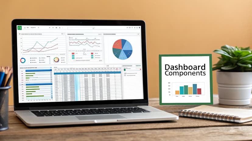
To build a truly effective dashboard, it's crucial to understand its foundational elements. These components work together to turn data into a clear, interactive story.
Core Components of an Effective Excel Dashboard
| Component | Purpose | Key Feature |
|---|---|---|
| Clean Data Source | To provide a reliable, error-free foundation for all analysis. | A structured Excel Table is ideal. |
| PivotTables & Charts | To summarize data and present it visually for quick interpretation. | Interactive elements like Slicers and Timelines. |
| Key Performance Indicators (KPIs) | To highlight the most critical metrics at a glance. | Large, clear numbers, often with trend indicators. |
| Interactive Controls | To allow users to filter and explore the data themselves. | Slicers, Timelines, and Drop-Down Menus. |
| Logical Layout | To guide the user’s eye and tell a coherent story with the data. | Arranged from high-level summary to fine detail. |
Each of these pieces plays a vital role in creating a dashboard that is not only visually appealing but also genuinely useful for making decisions.
The real power of an Excel dashboard isn't just in the charts it displays, but in the story it tells. It transforms a static spreadsheet into a dynamic conversation about your business performance, empowering anyone to see trends and ask smarter questions.
Your Roadmap to a Great Dashboard
I've designed this Excel dashboard tutorial to be as practical as possible. We’re going to focus on building a report where every single element has a clear purpose. It's all about creating a cohesive and insightful tool.
We'll start by laying a solid data foundation, then I'll show you how to pick the right charts to make your metrics pop. Finally, we'll work on a layout that guides the user's attention right where it needs to be. By the time we're done, you won't just have a report—you'll have a whole new way of looking at your data.
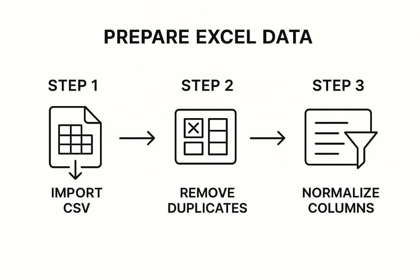
Preparing Your Data for a Flawless Dashboard
Let’s be honest: a dashboard is only as good as the data behind it. Before you even dream of picking out charts and colors, you need to lay a rock-solid foundation with clean, well-structured data. This isn't just about catching a few typos; it’s about making sure your source data can grow and adapt without breaking everything.
I’ve seen it countless times—people building charts directly from messy, static data ranges. This one mistake is the root cause of so many future headaches, from charts that won't update to metrics that are just plain wrong. A little bit of prep work now will save you hours of pain later on.
Structure Your Data with Excel Tables
If there's one technique I can't stress enough, it's using official Excel Tables. This is absolutely non-negotiable for any dynamic, professional-looking report. Don't just slap some colors and borders on your cells. Instead, select your data range and hit Ctrl + T (or navigate to Insert > Table).
So, why is this a game-changer? An Excel Table isn't static; it's a dynamic object. When you paste in new rows of sales data or update your project timelines, the table automatically expands. Any chart or PivotTable you’ve built from it will instantly recognize the new data with a simple refresh. No more manually adjusting source ranges. Ever.
Do yourself a favor and give your table a descriptive name, like "SalesData" instead of the default "Table1." It makes writing formulas and managing your workbook so much easier down the road.
Taming Common Data Problems
Once your data is housed in a proper table, the real cleanup can begin. Raw data from exports or manual entry is rarely perfect. It’s almost always littered with little inconsistencies that can throw your entire dashboard off.
Here are the usual suspects you need to hunt down:
- Duplicates: These redundant entries can seriously inflate your numbers. The
Data > Remove Duplicatestool is your best friend here. - Gaps: Empty cells can wreak havoc on calculations and charts. Decide on a consistent strategy: fill them with "N/A," a zero, or just remove the row entirely if it holds no value.
- Inconsistent Formatting: To Excel, "New York," "NY," and "new york" are three totally different places. Use
Find and Replace(Ctrl + H) or the magic ofFlash Fillto get all your text entries singing from the same hymn sheet.
A clean dataset is the bedrock of credible analysis. Every minute spent on data preparation is a minute saved in debugging and re-explaining your results to stakeholders.
This initial clean-up is often the most tedious part, but it’s also the most important. For a deeper dive into more advanced techniques, our guide on how to analyze data in Excel covers more complex scenarios. Think of data preparation not as a chore, but as the critical first step toward building a dashboard that people can actually trust.
Choosing the Right Charts to Tell Your Data Story

Alright, your data is clean, organized, and ready to go. Now for the fun part: making it visual. This is the moment in any dashboard project where the raw numbers start to actually speak. The goal here isn't just to make things look good; it's about picking the perfect chart to communicate your message with absolute clarity.
A poorly chosen chart can do more harm than good, muddying the waters or, even worse, leading your audience to the wrong conclusion. Think about the story you need to tell. Are you showing a trend over time? Comparing different categories? Trying to uncover the relationship between two numbers? Each question has a chart that's tailor-made to answer it.
Matching Your Data to the Right Chart
Let's move beyond just defaulting to a bar or pie chart and get a bit more strategic. Every chart type has a specific job. Think of yourself as a director casting the right visual for the right role in your data story.
Here’s a quick rundown for some common scenarios you’ll encounter:
- Showing Trends Over Time: The line chart is your best friend here. It’s perfect for tracking monthly sales, website traffic over the past year, or stock price movements. That continuous line makes it incredibly easy for anyone to spot trends, seasonality, and any weird outliers at a glance.
- Comparing Values Across Categories: This is where a bar or column chart truly shines. Use it to stack up sales figures for different products, compare how your marketing campaigns are doing, or see productivity levels across teams. The length of the bars gives you an instant, intuitive way to compare size and scale.
- Illustrating Parts of a Whole: While they can get a bad rap for being overused, a pie chart (or its slicker cousin, the donut chart) works well for showing things like market share or how a budget is divvied up. A key tip from experience: keep it to five or six slices, max. Any more than that, and it just becomes a confusing, unreadable mess.
Key Takeaway: Selecting the right chart is less about artistic flair and more about analytical precision. The best visualization is one that a viewer can understand in seconds, without needing you to explain what they're looking at.
Visualizing Financials and Relationships
For deeper analytical needs, you'll want to dig into some of Excel’s more specialized charts. These are the tools that can uncover insights that the simpler charts might just skim over.
For example, imagine you're presenting a quarterly financial report. Instead of a basic stacked column showing revenue and costs, a waterfall chart is a game-changer. It brilliantly shows how a starting value (like your initial revenue) gets hit with a series of positive and negative changes (sales, refunds, operating costs) to land on a final number. It tells the story of your cash flow in a way that’s incredibly clear.
What if you think there's a connection between two different metrics, like your ad spend and the number of new sign-ups? This is the perfect job for a scatter plot. By plotting those two variables on the X and Y axes, you can see if there's a relationship. If you see a tight cluster of points trending upwards, you might have just found a strong positive correlation—a huge insight to guide where you put your money next.
If you want to get into the nitty-gritty of building these, our guide on how to create charts in Excel provides a great step-by-step walkthrough.
Designing an Intuitive and User-Friendly Layout
A great dashboard is so much more than a bunch of charts just dumped onto a spreadsheet. It’s a deliberate, intuitive interface that tells a clear story at a glance. The layout itself is a huge part of the puzzle, because a bad design can make even the most insightful data completely confusing.
Your real goal here is to build a report that someone can understand in seconds, not minutes. They should be able to look at it and instantly get the main takeaways. This isn't about being an artist; it's about practical design and logical organization.
Arranging Elements for Maximum Impact
Think about how you're reading this page right now. In most Western cultures, we read from left to right, and top to bottom. This "F-pattern" is a really powerful concept to apply to your dashboard design.
What does that mean in practice? It means your most critical, high-level information needs to live in the top-left corner. That spot is prime real estate.
Put your main Key Performance Indicators (KPIs) there—the big, unmissable numbers like total revenue, customer satisfaction score, or the overall project completion percentage. As the user’s eye naturally moves down and to the right, you can introduce the more detailed, granular charts that support those headline figures.
So, if your top-left KPI is "Total Sales," the charts immediately to its right or just below it should break that number down by region, product category, or sales rep. This creates a logical flow, guiding the user from the big picture summary down into the supporting details.
A dashboard should be designed for a five-second test. If a user can’t understand the main takeaways within five seconds, the layout has failed. Your design has to guide the eye, not confuse it.
The Power of Grids and White Space
To keep your dashboard from looking like a cluttered, chaotic mess, try using a grid system. You can easily create a simple grid by setting your column widths and row heights to be uniform. This underlying structure helps you align your charts and tables neatly, giving everything a clean, organized, and professional look.
And please, don't be afraid of white space! It’s one of the most powerful design tools you have at your disposal. Leaving some empty space between your charts and tables helps to visually separate different pieces of information. This dramatically reduces the mental effort required to understand the dashboard and makes each component easier to digest. Think of it as the visual equivalent of taking a breath between sentences.
Using Color with Purpose
Color should always be used sparingly and with a clear purpose. One of the most common mistakes I see is dashboards that look like a rainbow exploded—tons of bright, competing colors that just create visual noise and distract from the data. Instead, develop a simple and consistent color palette.
Here are a few tips:
- Highlight Key Data: Use a single, bright, attention-grabbing color to highlight the most important data point in a chart. The rest of the chart can use muted, neutral tones like gray or a soft blue.
- Be Consistent: If you use blue to represent "Sales" in one chart, make sure you use that same blue for sales in every other chart on the dashboard. This consistency helps users build a quick mental shortcut for understanding what they're looking at.
- Color with Meaning: Lean on colors that have intuitive meanings. For instance, using green for positive results (like profit or growth) and red for negative ones (like expenses or losses) is a convention that almost everyone understands instantly.
These principles are really the foundation of effective dashboard design. To take your skills even further, check out our complete guide on data visualization best practices for more advanced techniques.
Making Your Dashboard Interactive with Slicers
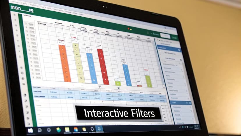
A static report is just a picture of your data. A great dashboard, on the other hand, is a conversation with your data. The goal is to move beyond simply presenting numbers and instead empower your audience to explore, question, and discover insights for themselves. This is where we bring your dashboard to life with interactive controls.
The real magic comes from two of my favorite Excel features: Slicers and Timelines. Think of Slicers as sleek, modern filter buttons. Instead of wrestling with clunky drop-down menus in a PivotTable, your users can just click a button—like "North Region" or "Q3"—and watch the entire dashboard instantly respond. It’s a game-changer for user experience.
Introducing Slicers for Dynamic Filtering
At their core, Slicers are simply visual filters that work with PivotTables, PivotCharts, and even standard Excel Tables. Adding them is incredibly easy. First, click on any PivotChart or PivotTable you've created. Then, head over to the PivotTable Analyze tab on the ribbon and select Insert Slicer.
A pop-up will appear, showing you all the available fields from your source data. For a typical sales dashboard, I almost always add slicers for fields like "Region," "Product Category," and "Sales Rep." This simple step allows anyone looking at the dashboard to mix and match filters on the fly, drilling down to answer their own specific questions without needing my help.
For example, a sales manager could click "West" on the Region slicer and "Gadgets" on the Category slicer. Instantly, all the charts will update to show exactly how that product line is performing in that specific territory. This kind of dynamic interaction is what separates a basic spreadsheet from a professional tool built with techniques from a true excel dashboard tutorial.
Connecting a Single Slicer to Multiple Charts
Here’s where you can really level up your dashboard design. The most powerful trick is to make a single slicer control multiple charts and tables at once. Imagine having five different visuals—sales trends, product performance, profit margins—all updating in unison from one "Year" slicer. This creates a seamless, intuitive experience for the end-user.
It's simpler than it sounds. Start by creating a slicer from one of your PivotTables. Once it's on your sheet, just right-click the slicer and choose "Report Connections."
A dialog box will pop up, listing every PivotTable in your workbook.
From here, you can simply check the boxes for all the PivotTables you want that single slicer to control. It's a quick way to ensure a unified filtering experience across your entire dashboard.
Using Timelines for Date-Based Analysis
While Slicers are fantastic for filtering categories like "Region" or "Product," Timelines are purpose-built for dates. If you have a date column in your data, you can insert a Timeline—a sleek, slidable control that lets users filter by years, quarters, months, or even days. For any kind of time-series analysis, it's far more elegant and user-friendly than a standard filter.
Key Insight: Interactivity transforms your audience from passive observers into active participants. When users can filter and explore data on their own terms, they gain a deeper understanding and are more likely to uncover valuable insights themselves.
This demand for dynamic reporting is only growing. The global market for data visualization tools, where Excel dashboards are a key player, is projected to reach US$10.8 billion by 2027. This growth is driven by the universal need for clear, actionable intelligence. For a deeper dive, check out these dashboard market trends and statistics.
Got Questions? We’ve Got Answers
Even with the best guide, you're bound to run into a few head-scratchers when you're deep in the weeds of building a dashboard. Let's tackle some of the most common questions that pop up. These are the quick, practical answers I've found most helpful over the years.
How Do I Get My Dashboard to Update Automatically?
This is the big one. The secret isn't some complicated macro; it's building everything on a proper Excel Table.
When your charts and PivotTables are all linked to a source Table, all you have to do is drop new data into it. Head to the 'Data' tab, hit 'Refresh All,' and watch everything snap into place. It’s that simple.
If you want a truly hands-off setup, Power Query is your best friend. You can use it to connect directly to an external source, like another file or a database. Then, you can set it to automatically refresh the data every single time the workbook is opened. Your dashboard will always be up-to-date, no clicks required.
What's the Single Biggest Mistake to Avoid?
Without a doubt, it’s visual clutter. It happens to everyone at first—the temptation to squeeze every last metric onto a single screen, often with a clashing rainbow of colors. The result is an overwhelming mess that no one can actually use.
A great dashboard isn't about showing everything; it's about showing the right things clearly. Simplicity is your most powerful design tool.
Embrace a clean, minimalist approach. Use a limited, consistent color palette and plenty of white space to let your data breathe. Before you add anything, ask yourself: "Does this chart answer a specific, important business question?" If it doesn't, it’s just noise. Get rid of it.
Can I Share My Dashboard with People Who Don't Have Excel?
Yes, you absolutely can. While the full interactive experience shines on the desktop app, you have some great options for sharing your work with anyone.
Here’s how you can share your dashboard, even with non-Excel users:
- A Quick Snapshot: The easiest way is to save the dashboard tab as a PDF. This creates a clean, static image of your report—perfect for printing or attaching to an email.
- A Live, Interactive View: For a much better experience, upload the Excel file to OneDrive or SharePoint. You can then share a web link. This lets people open and interact with the dashboard—Slicers, Timelines, and all—right in their browser using Excel for the Web.
That second option is a game-changer. It keeps the dynamic, interactive feel of your dashboard alive without forcing anyone to install software.
Are you ready to stop wrestling with complex formulas and start getting answers? With Elyx.AI, you can analyze data, clean tables, and generate insights using simple text prompts right inside your spreadsheet. Bring the power of AI to your Excel workflow and transform how you work with data. Discover how Elyx.AI can help you today.
Reading Excel tutorials to save time?
What if an AI did the work for you?
Describe what you need, Elyx executes it in Excel.
Sign up