Measuring Customer Satisfaction in Excel: A Practical Guide with AI

Measuring customer satisfaction is all about listening. It’s the process of collecting and analyzing customer feedback to understand how people feel about your products, services, and overall experience. By using established metrics within a tool like Excel, you can turn those feelings into actionable data that helps build loyalty and prevent customer churn. This guide will show you how to solve this problem, providing practical steps and real-world examples.
Why Happy Customers Are Not Enough
We've all heard it before: a satisfied customer is a loyal customer. It seems to make perfect sense, but in reality, it's not that simple. A customer can be perfectly happy with a one-time purchase but have zero emotional investment in your brand. If a competitor dangles a slightly better offer tomorrow, they're gone.
The real goal isn't just a fleeting moment of satisfaction. It's about building genuine, lasting loyalty.
Spending too much time on Excel?
Elyx AI generates your formulas and automates your tasks in seconds.
Sign up →For any business serious about long-term growth, the focus has to shift. You need to understand how to increase customer lifetime value by building relationships that last, not just completing transactions. This distinction is what separates businesses that thrive from those that just survive.
The Satisfaction vs. Loyalty Gap
The space between a happy customer and a truly loyal one is a dangerous place for a business to be. This isn't just a theory; the data backs it up.
A massive global study from the Qualtrics XM Institute surveyed nearly 24,000 consumers and uncovered a startling trend. While overall satisfaction scores have remained pretty steady, the metrics that really matter for loyalty—like trust, advocacy, and intent to buy again—are falling behind. This proves it: just because a customer is satisfied doesn't mean they're sticking around.
This chart from the study paints a very clear picture of that disconnect.

The takeaway is clear: A lot of customers will say they're satisfied, but far fewer are willing to actually trust you, recommend you, or spend their money with you again.
Choosing Your Customer Satisfaction Metric
A quick guide to the three core metrics, what they actually measure, and where they fit best in your business.
| Metric | What It Measures | Best Used For |
|---|---|---|
| CSAT (Customer Satisfaction Score) | Short-term happiness with a specific product or interaction (e.g., a support call). | After key moments like a purchase, a feature launch, or a customer service ticket is closed. |
| NPS (Net Promoter Score) | Overall brand loyalty and the likelihood a customer will recommend you to others. | As a big-picture health check, often sent quarterly or semi-annually. |
| CES (Customer Effort Score) | How easy it was for a customer to resolve an issue or achieve a goal. | Immediately after a customer service interaction or using a self-service tool. |
These metrics give you a structured way to listen and learn, helping you choose the right tool for the right moment in the customer's journey.
Turning Feedback Into a Roadmap with Excel and AI
So, how do you close that loyalty gap? You have to start by listening—really listening. Measuring customer satisfaction isn't about sending a generic survey once a year and calling it a day. It's about systematically gathering feedback using the right metrics for the job.
These aren't just buzzwords; they are your essential listening tools.
When you start collecting and analyzing data from these metrics, you begin to turn raw, emotional feedback into a clear, actionable roadmap for making things better. The good news is you don't need a massive analytics department to do this. Modern tools like Excel, especially when powered up with an AI add-in like Elyx.AI, can do the heavy lifting. You can quickly analyze survey responses, find themes in open-ended comments, and create compelling charts to share with your team.
Choosing the Right Metrics for Your Business
Forget a one-size-fits-all rulebook for measuring customer satisfaction. The real question you should be asking is, "What do I really need to know right now?" Think of different metrics as lenses—each one brings a specific part of the customer experience into sharp focus. Your job is to pick the right lens for the moment.
A fast-growing SaaS company, for example, might be laser-focused on its Customer Effort Score (CES). They need to know how easy it was for a user to get help after submitting a support ticket. In a crowded software market, a low-effort experience is a huge factor in keeping users from jumping ship.
Now, contrast that with a direct-to-consumer brand that thrives on word-of-mouth. For them, the Net Promoter Score (NPS) is everything. They aren't just looking for one-time sales; they need to cultivate true brand fans. A quarterly NPS survey gives them a powerful snapshot of overall loyalty and helps them find those all-important evangelists. If you want to get into the nitty-gritty of this metric, our guide on Net Promoter Score calculation is a great resource.
Aligning Metrics with Customer Touchpoints
The secret to truly useful feedback is timing. Sending a survey at the wrong time is like asking for a movie review before the credits roll—the response you get won't tell you much.
The most powerful feedback is captured right in the moment. When you tie your survey to a specific interaction, you get an unfiltered signal about that experience, making it incredibly easy to see exactly what needs fixing.
Map out your customer's journey and look at the key interactions. Each one is a golden opportunity to listen.
- Post-Purchase Feedback: The moment a customer completes a purchase is the perfect time for a Customer Satisfaction (CSAT) survey. A quick, simple question like, "How satisfied were you with your checkout experience?" gives you instant insight.
- After a Support Call: As soon as a support ticket is resolved, send a CES survey. Asking, "How easy was it to resolve your issue?" cuts right to the chase and tells you how efficient your support team is.
- Quarterly Relationship Check-ins: To gauge long-term loyalty, an NPS survey sent out periodically works wonders. It helps you zoom out from single transactions and see the bigger picture of your customer relationships.
This visual guide can help you match your goals with the right metric and touchpoint, taking the guesswork out of your strategy.
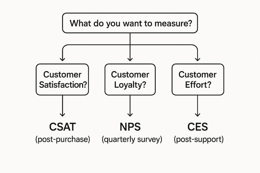
As the infographic makes clear, the question you need to answer determines the tool you should use. This ensures every piece of feedback you gather is tied directly to a business goal.
Making Your Data Actionable in Excel
Okay, you've picked your metrics and the responses are rolling in. Now what? This is where a tool as familiar as Excel can become your command center for customer insights. You can pull all your raw data from CSAT, NPS, and CES surveys into one organized workbook.
From there, the real work begins: calculating scores, spotting trends over time, and slicing the data by customer demographics or product lines. And with an AI add-in like Elyx.AI, you can even dive into all those open-ended comments to find recurring themes. It transforms that messy qualitative feedback into hard data, saving you from hours of manual sorting and giving you a clear roadmap for what to do next.
Designing Surveys People Will Actually Answer
Let's be honest: nobody likes filling out a long, confusing survey. If you want to measure customer satisfaction, you have to do more than just ask for feedback—you have to design a process that people will actually engage with.
An unanswered survey is a lost conversation. Even worse, a poorly designed one can give you bad data from customers just clicking through to get it over with. The goal is to make giving feedback feel easy and valued, not like a chore.
Crafting Unbiased and Clear Questions
The foundation of any good survey is the questions you ask. It’s surprisingly easy to accidentally steer customers toward the answer you want to hear, which completely defeats the purpose.
For example, asking, "How much did you enjoy our amazing new feature?" is a classic leading question. A much better, more neutral way to phrase it would be, "How would you rate your experience with our new feature?"
Keep your language simple and direct. Ditch the internal jargon your customers won't understand. Each question should tackle just one idea to avoid messy, ambiguous answers. If you're looking for inspiration on how to frame things effectively, checking out some real-world Voice of Customer (VoC) examples can be a great starting point.
Here are a couple of common traps to avoid:
- The Leading Question: "Don't you agree our support team is the best?"
- The Fix: "How would you rate the quality of the support you received?"
- The Double-Barreled Question: "Was our website easy to navigate and was the checkout process fast?"
- The Fix: Break this into two separate questions. You need to know about navigation and checkout individually.
Choosing the Right Channel and Length
When and where you ask for feedback is just as important as what you ask. The right channel really depends on the customer's specific interaction with your business.
- Email works well for deeper, relationship-focused surveys, like a quarterly NPS check-in. It gives people the flexibility to respond on their own time.
- In-app pop-ups are fantastic for grabbing immediate feedback right in the moment. Think of a quick CSAT or CES question after a customer uses a new tool.
- SMS is perfect for short, transactional questions. A simple "Rate your delivery experience from 1-5" is super easy to answer via text.
Getting this right is critical because bad experiences drive customers away. We've all been there—stuck on hold forever or having to explain our issue for the third time. The data backs this up: 53% of customers point to long hold times as a reason for leaving a brand, and 54% will switch after having to repeat their problems.
This chart drives the point home, showing just how little patience customers have for poor experiences.

As you can see, loyalty isn't a given. It's earned through consistently positive interactions.
My rule of thumb? Keep it short and to the point. Once a survey goes beyond 5-7 questions, you'll see a big drop in how many people finish it. Respect your customer's time, and in return, you'll get the kind of high-quality data you can actually use for analysis in Excel.
Finding the Story in Your Data with Excel and AI
Collecting feedback is one thing, but the real magic happens when you turn all that raw data into a clear story that guides your business. This is where a tool you already know and use—Excel—can become your command center for customer insights, especially when you bring a little AI into the picture.
Your first move is always to get the data organized. Whether you're working with a CSV export from a survey tool or a shared spreadsheet, the goal is to get everything into a clean, structured table. Once that’s done, you can start crunching the numbers with some basic Excel formulas.
Calculating Core Metrics in Excel
Before you can spot trends, you have to get your baseline scores. Excel makes this part pretty simple.
- For CSAT: Just use the
=AVERAGE()function on the column with your satisfaction scores (like 1-5 ratings) to get the average. If you prefer a percentage, a formula like=COUNTIF(range, ">=4")/COUNT(range)will show you the percentage of satisfied customers (those who rated 4 or 5). - For NPS: This one takes a few more steps. You’ll need to count your Promoters (scores 9-10), Passives (7-8), and Detractors (0-6). The formula looks like this:
(COUNTIF(range, ">=9") - COUNTIF(range, "<=6")) / COUNT(range). Just format the cell as a percentage, and you have your Net Promoter Score. - For CES: Much like CSAT, a simple
=AVERAGE()on your effort scores (e.g., 1-7) gives you a clear measure of how easy it was for customers to interact with you.
With these core numbers in hand, you can start tracking them over time, building charts to see how things are changing, and even creating a dashboard to keep an eye on the health of your customer relationships. If you're just getting started with this, our detailed guide on how to analyze survey data is a great place to build your foundation.
Unleashing AI for Deeper Qualitative Insights
While your scores tell you what's happening, it's the open-ended comments that tell you why. This qualitative feedback is a goldmine, but nobody has time to manually read through hundreds or thousands of comments. This is exactly where an AI add-in like Elyx.AI completely changes the game, right inside your spreadsheet.
Customer experience has become the main battlefield for brands. It’s not just about a product working; it’s about the emotional connection. In fact, a recent Ipsos report found that 70% of customers globally now choose brands expecting a great experience. You can discover more about these CX insights on Ipsos.com.
AI helps you tap into those emotional drivers at scale. Instead of losing hours to manual reading, you can use simple, conversational prompts to get complex analysis done in seconds.
This visual from the Ipsos report highlights the six key drivers that build strong customer relationships.
It shows that things like certainty, fair treatment, and a sense of control are what really create the connections that lead to loyalty. AI can analyze your customers' own words to pinpoint exactly where you're hitting the mark or falling short on these crucial elements.
Here are a few ways an AI tool inside Excel can help:
- Perform Sentiment Analysis: Instantly get an emotional barometer of your customer base. A simple prompt can categorize every comment for you.
- Identify Recurring Themes: Automatically surface persistent issues that keep popping up in feedback, like "slow shipping" or "confusing checkout."
- Generate Instant Summaries: Turn hours of manual synthesis into a single query that gives you the big picture in a flash.
Practical AI Prompts for Feedback Analysis
Use these simple prompts with an Excel AI add-in to instantly analyze qualitative customer feedback.
| Your Goal | Example AI Prompt |
|---|---|
| Quick Emotional Check | "Analyze the sentiment of the comments in column C as Positive, Negative, or Neutral." |
| Find Common Problems | "What are the top 5 most common themes mentioned in the negative feedback in column C?" |
| Find What's Working | "Identify the top 3 positive themes from the comments in column C with scores of 9 or 10 in column B." |
| Get a Fast Summary | "Summarize the key findings from this survey data, including the main positives and negatives." |
| Categorize Feedback | "Categorize each comment in column C into one of these topics: Pricing, Product Quality, Customer Service, or Shipping." |
By bringing AI directly into the environment where your data already lives, you skip the tedious manual work and get straight to the insights that matter.
Turning Your Insights Into Action
Collecting data is just the beginning. Let's be honest, the real magic happens when you take those numbers and comments from your Excel analysis and turn them into actual improvements for your business. Data without action is just trivia; a smart plan based on that data is what really moves the needle.

This whole process is often called "closing the feedback loop." It's your way of showing customers you're not just sending surveys into the void. You're listening, and you're committed to getting better. Acknowledging feedback and acting on it is one of the most powerful ways to build trust and keep people coming back.
Creating Your Action Plan Framework
So, your AI analysis in Excel has highlighted a few key themes—maybe it's "slow shipping" or a "confusing interface." Now what? It's time to build a straightforward action plan. A priority matrix, created right there in your spreadsheet, is a simple and surprisingly effective way to get organized.
I like to set up columns for these key details:
- Issue: What's the specific problem? (e.g., "Customers find the checkout process too long").
- Impact: Who is this affecting the most? (e.g., "High impact on Detractors").
- Frequency: How often is this coming up in the feedback?
- Owner: Which team is responsible for fixing it? (e.g., Product, Marketing, Operations).
- Action Step: What's the one concrete, measurable thing we'll do next?
Prioritizing is everything. My advice? Zero in on the high-frequency issues that are creating the most negative sentiment. Fixing a problem that frustrates 30% of your Detractors will do far more for your overall scores than tweaking a minor issue mentioned by a few Promoters.
This kind of structured approach takes you from a messy list of complaints to an organized, actionable roadmap. And by assigning an owner to each item, you make sure someone is truly accountable.
Sharing Findings and Aligning Teams
Your insights are only as good as the people who see them. But don't just email the raw data to everyone. Different teams need different takeaways, so frame the information in a way that’s relevant and actionable for each group.
- For the Product Team: Give them the direct quotes and theme analysis about feature requests, bugs, or usability issues. This is pure gold for their development sprints.
- For the Marketing Team: Share all the great things your Promoters are saying. Those glowing comments can easily be turned into powerful testimonials, case studies, or fresh marketing copy.
- For the Operations Team: Data on shipping delays, packaging problems, or delivery mix-ups is exactly what they need to fine-tune their processes.
Sharing these specific insights also helps you set clearer goals across the board. For example, understanding why certain customers are unhappy leads to much better targeting and messaging. If you want to go deeper on this, take a look at our guide on customer segmentation analysis to see how you can really sharpen your strategies.
By creating this continuous cycle of listening, analyzing with tools like Excel and AI, and then taking deliberate action, customer feedback becomes your most valuable asset for growth. It’s a commitment to constant improvement—and believe me, customers notice.
Your Top Questions, Answered
When you start digging into customer satisfaction, a few questions always seem to pop up. Let's tackle some of the most common ones I hear from teams just like yours, so you can get started on the right foot.
How Often Should We Send Out Surveys?
There’s no single right answer here—it really depends on what you're trying to measure.
For those immediate, in-the-moment feelings, timing is everything. Think about transactional metrics like CSAT or CES. You'll want to send that survey right after a key interaction, like when a customer completes a purchase or a support agent closes their ticket. That’s when the experience is freshest in their mind.
But for relationship-level feedback, like what you get from an NPS survey, you need to play the long game. Bombarding customers with these will just lead to survey fatigue. A quarterly or semi-annual check-in is usually the sweet spot. It's frequent enough to catch changes in loyalty but spaced out enough to not be annoying.
What’s a “Good” Customer Satisfaction Score, Anyway?
This is the million-dollar question, and the honest answer is: it depends. What’s considered “good” can vary wildly from one industry to another. Still, having some general benchmarks helps you find your bearings.
- CSAT: Typically, you're looking at the percentage of customers who gave a positive rating (like a 4 or 5 on a 5-point scale). If you're hitting 80% or higher, you’re doing pretty well.
- NPS: This one has a huge range, from -100 to +100. A score above 0 is decent, anything over 50 is excellent, and if you’re north of 70, you're in world-class territory.
- CES: Since this measures effort, lower is better. On a typical 1-7 scale, an average score below 3 suggests you’re making things easy and painless for your customers.
The real goal isn't just to hit some arbitrary industry number. It's about setting your own baseline and focusing on steady, consistent improvement. That upward trend is your most important KPI.
Can I Measure Satisfaction Without Annoying People with Surveys?
Absolutely. Surveys are great for direct feedback, but they aren't the only tool in your shed. You can learn a ton just by looking at the customer data you're probably already collecting.
You can actually track some powerful proxy metrics right in Excel:
- Repeat Purchase Rate: This is one of the simplest and most telling signs. Do customers come back for more? If so, you're doing something right.
- Customer Churn Rate: A rising churn rate is like a smoke alarm for dissatisfaction. It's an early warning that something is wrong under the hood.
- Social Media Mentions: You can use an AI tool in Excel to run sentiment analysis on what people are saying about you online. It’s a fantastic way to get raw, unfiltered opinions.
These indirect methods give you a continuous pulse on customer sentiment, often without having to ask a single question.
Ready to stop guessing and start knowing what your customers truly think? Elyx.AI brings the power of AI right into your Excel workflow. You can analyze sentiment, pull out key themes from feedback, and create reports with simple text prompts. Turn your customer data into clear, actionable insights without ever leaving your spreadsheet. See how it works at https://getelyxai.com.
Reading Excel tutorials to save time?
What if an AI did the work for you?
Describe what you need, Elyx executes it in Excel.
Sign up