8 Practical Excel Pivot Table Examples to Master in 2025

Pivot tables are one of Excel's most powerful features, yet many users barely scratch the surface of their true potential. While basic sums and counts are useful, a strategically built pivot table can transform an overwhelming grid of raw data into a dynamic dashboard for actionable business intelligence. This guide moves beyond the basics to provide eight real-world excel pivot table examples, each designed to solve a specific, common business problem and deliver strategic insights.
We will deconstruct each example, showing you not just what to build, but why specific layouts and fields are chosen. You will learn the exact steps to replicate these analyses for your own needs. The goal is to equip you with practical, replicable methods to turn complex datasets into your most valuable asset.
Whether you're analyzing sales performance, tracking project resources, or segmenting customer data, mastering these pivot table structures will fundamentally elevate your data analysis capabilities. From finance and HR to marketing and operations, these examples provide a blueprint for driving smarter, data-informed decisions. This article breaks down the tactics you need to unlock the strategic power hidden within your spreadsheets.
Spending too much time on Excel?
Elyx AI generates your formulas and automates your tasks in seconds.
Sign up →1. Sales Performance Analysis Pivot Table
One of the most powerful and common excel pivot table examples is the Sales Performance Analysis dashboard. This tool transforms raw sales data into a dynamic report, allowing businesses to analyze revenue, units sold, and profit margins across multiple dimensions like time, product, and sales representatives. It's the go-to method for identifying top performers, understanding seasonal trends, and evaluating product profitability.
A retail company, for instance, can use this pivot table to track monthly sales and pinpoint which products are driving revenue. Similarly, a sales manager can prepare for quarterly performance reviews by filtering data for each team member, comparing their results against targets and identifying coaching opportunities.
Strategic Setup and Key Insights
To build an effective sales pivot table, strategic field placement is crucial.
- Rows: Place
Sales RepresentativeorProduct Categoryhere to create a primary axis for comparison. - Columns: Drag
Order Dateinto this area. Excel's grouping feature can automatically consolidate dates into months, quarters, and years, making trend analysis effortless. - Values: This is where you place your key metrics. Sum
Revenue,Units Sold, andProfitto get your core performance indicators.
Strategic Tip: Add a calculated field to derive new metrics directly within the pivot table. For example, create an 'Average Order Value' (AOV) by using the formula
= Revenue / 'Number of Orders'to gain deeper insights without altering your source data.
Actionable Takeaways for Performance Improvement
This pivot table isn't just for reporting; it's a decision-making tool. By adding slicers for Region or Product Line, you create an interactive dashboard that allows stakeholders to filter the data and uncover specific insights on their own.
You can also apply conditional formatting to instantly highlight top and bottom 10% performers, drawing immediate attention to areas of excellence or those needing improvement. This visual cue helps managers quickly identify who to reward and which team members may need additional support.
The following infographic visualizes key metrics a typical sales performance pivot table can generate, such as top product category, revenue growth, and average profit margin.
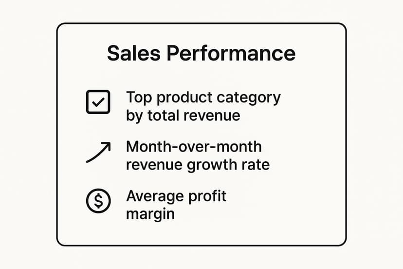
This quick reference summary clearly shows which areas are driving success and provides a high-level overview of business health, enabling leaders to make data-backed strategic decisions.
2. Budget vs. Actual Expense Tracking
One of the most essential excel pivot table examples for financial governance is the Budget vs. Actual Expense Tracking report. This powerful tool provides a clear, dynamic comparison of planned budgets against actual expenditures. It allows organizations to monitor financial health across departments, expense categories, and time periods, making it indispensable for identifying budget variances and maintaining fiscal discipline.
For instance, a corporate finance department can use this pivot table to monitor the company's annual budget, providing stakeholders with a real-time view of spending patterns. Similarly, a project manager in a construction firm can track project-specific costs, ensuring expenses stay within the allocated budget to protect profit margins.
Strategic Setup and Key Insights
To build an effective budget variance pivot table, careful field arrangement is key to revealing meaningful financial insights.
- Rows: Place
DepartmentorExpense Categoryhere to establish the primary dimension for your analysis. This lets you see exactly where money is being spent. - Columns: Use
MonthorQuarterin this area to track spending over time and identify trends or seasonal spending spikes. - Values: Drag
Budget AmountandActual Spendinto this section. Use the SUM function for both to get your core financial figures.
Strategic Tip: Create a calculated field to automatically compute the variance. Use the formula
= 'Budget Amount' - 'Actual Spend'to create a 'Variance' column. You can also create a 'Variance %' with the formula= ('Budget Amount' - 'Actual Spend') / 'Budget Amount'to instantly see the magnitude of over or under spending.
Actionable Takeaways for Performance Improvement
This pivot table is more than just a financial statement; it's a proactive control mechanism. By applying conditional formatting, you can automatically highlight any budget overruns in red, drawing immediate attention to areas that require investigation. This visual alert system enables managers to address overspending before it becomes a critical issue.
Adding slicers for Project or Region transforms the report into an interactive dashboard, empowering department heads to drill down into their specific data. For organizations seeking to streamline this process, exploring Excel report automation can further enhance efficiency, ensuring these crucial reports are generated and distributed without manual intervention. This allows for timely, data-driven decisions that keep the organization on firm financial footing.
3. Customer Demographics and Segmentation Analysis
Understanding your customer base is fundamental to targeted marketing, and a pivot table for customer demographics is one of the most effective excel pivot table examples for this purpose. This analysis transforms raw customer data into an actionable summary, allowing businesses to segment their audience by age, location, and purchase behavior. It's an indispensable tool for tailoring marketing campaigns, personalizing user experiences, and identifying new market opportunities.
An e-commerce retailer, for example, can use this pivot table to discover that a specific age group in a certain city is their most profitable segment. Similarly, a healthcare provider can analyze patient demographics to better allocate resources and plan community outreach programs, ensuring services meet the needs of their local population.

Strategic Setup and Key Insights
To build a meaningful demographic analysis, the right field arrangement is essential for clear segmentation.
- Rows: Place
Age GrouporGeographic Location(like City or State) here to segment your customer base. - Columns: Use
Product CategoryorPurchase Monthto analyze buying habits across your primary segments. - Values: Sum
Total Revenueand CountCustomer IDto measure both the value and size of each demographic group.
Strategic Tip: Use Excel's grouping feature on a numeric
Agecolumn to create custom age brackets (e.g., 18-24, 25-34, 35-44). This transforms individual ages into clean, report-friendly segments for more powerful analysis.
Actionable Takeaways for Performance Improvement
This pivot table is a powerful tool for developing highly targeted strategies. By adding slicers for Gender or Acquisition Channel, you can create an interactive dashboard that reveals which marketing efforts attract specific customer profiles. This level of detail is a core component of effective data mining in Excel, turning raw information into strategic intelligence.
You can also use a pivot chart, such as a bar chart, to visually represent the distribution of customers across different age groups or locations. This provides an immediate, at-a-glance understanding of your primary audience, helping marketing teams decide where to focus their budget for maximum impact.
4. Inventory Management and Stock Analysis
Another essential application in our list of excel pivot table examples is for Inventory Management and Stock Analysis. This pivot table transforms raw inventory data-like product IDs, stock levels, warehouse locations, and movement dates-into an actionable report. It helps businesses optimize stock levels, prevent stockouts or overstocking, and reduce carrying costs by providing a clear view of inventory health.
A retail chain, for example, can use this analysis to track which products are selling fastest and require frequent reordering, while a manufacturer can monitor raw material consumption to ensure production lines are never halted due to shortages. This tool is fundamental for supply chain and operations managers aiming for efficiency.

Strategic Setup and Key Insights
To build a powerful inventory analysis pivot table, focus on fields that reveal movement and value.
- Rows: Place
Product NameorSKUhere to analyze inventory on an item-by-item basis. You can also group these byProduct Categoryfor a higher-level view. - Columns: Use
Warehouse Locationto compare stock levels across different distribution centers or stores. - Values: Sum
Quantity on Handto see current stock levels. Average or SumUnit CostandTotal Valueto understand the financial investment tied up in inventory.
Strategic Tip: Create a calculated field for 'Inventory Turnover Ratio' (e.g.,
= 'Cost of Goods Sold' / 'Average Inventory'). This key performance indicator measures how quickly stock is sold, helping you identify slow-moving products that may need to be discounted or discontinued.
Actionable Takeaways for Performance Improvement
This pivot table is more than a simple stock count; it's a strategic command center for your supply chain. By adding slicers for Supplier or Date Range, you can quickly filter the data to investigate specific issues, like which suppliers are consistently late or how stock levels fluctuate seasonally.
Use conditional formatting to automatically highlight items that fall below a pre-set reorder point. This creates a visual alert system, ensuring that you proactively manage replenishment and avoid costly stockouts. For example, color-coding cells red for stock levels below 20 units draws immediate attention, prompting timely action from the inventory management team and ensuring a smooth supply chain operation.
5. Employee Performance and HR Analytics
Human Resources departments leverage excel pivot table examples to turn vast employee datasets into strategic insights. An HR analytics pivot table synthesizes information like performance ratings, attendance, training completion, and compensation, allowing for data-driven workforce planning and talent management. It's an indispensable tool for identifying trends and making objective decisions.
For example, an HR manager can use this pivot table to analyze annual performance review data, identifying high-potential employees or departments with skill gaps. It also supports diversity and inclusion reporting by summarizing demographic data across different job levels and functions, ensuring equitable practices.
Strategic Setup and Key Insights
Building a meaningful HR pivot table requires organizing employee data effectively to reveal actionable patterns.
- Rows: Place
DepartmentorJob Titlehere to segment the workforce and compare metrics across different groups. - Columns: Use
Performance Rating(e.g., "Exceeds Expectations," "Meets Expectations") to see the distribution of performance levels within each department. - Values: Drag
Employee IDinto this field and set it to 'Count' to get a headcount for each performance category. Use 'Average' for fields likeSalaryorTraining Hoursto benchmark compensation and development.
Strategic Tip: Combine datasets to enrich your analysis. For instance, link performance data with attendance records. Beyond simple performance reviews, analyzing workforce data with pivot tables can help in areas like attendance and leave management, a common practice for which an Excel holiday tracker can serve as a foundation.
Actionable Takeaways for Performance Improvement
This pivot table is a powerful instrument for shaping HR strategy. By adding slicers for Hire Date or Manager, you can create an interactive dashboard for HR business partners and executives to explore talent distribution and tenure trends on their own.
Use conditional formatting to visually flag departments with a high concentration of low performers or highlight teams with exceptional training completion rates. This immediate visual feedback helps direct resources, such as coaching or development programs, to the areas where they are needed most. This transforms the pivot table from a simple report into a proactive talent management tool.
6. Marketing Campaign ROI Analysis
Another indispensable entry in our list of excel pivot table examples is the Marketing Campaign ROI Analysis. This pivot table transforms complex campaign data from various sources like Google Ads or Facebook Business Manager into a clear, unified report. It allows marketers to measure the return on investment (ROI) for different campaigns, channels, and customer acquisition strategies, ensuring marketing budgets are allocated for maximum impact.
For example, a digital marketing team can use this pivot table to compare the cost-per-acquisition (CPA) of a social media campaign against an email marketing initiative. This direct comparison helps identify which channels are most cost-effective and where to scale spending for future efforts.
Strategic Setup and Key Insights
To build an effective marketing ROI pivot table, precise field placement is essential for clarity.
- Rows: Place
Campaign NameorMarketing Channelhere to serve as the primary dimension for your analysis. - Columns: Use
Date(grouped by month or quarter) to track performance and spot trends over time. - Values: This area should contain your key performance indicators. Sum
Ad Spend,Conversions(orLeads), andRevenue Generated.
Strategic Tip: Create calculated fields to measure efficiency metrics directly within the pivot table. A crucial one is 'Cost Per Acquisition' (CPA), using the formula
= 'Ad Spend' / Conversions, or 'Return on Ad Spend' (ROAS) with= 'Revenue Generated' / 'Ad Spend'.
Actionable Takeaways for Performance Improvement
This pivot table is a powerful tool for optimizing marketing spend and strategy. By adding slicers for Audience Segment or Ad Creative, you can create a dynamic dashboard that reveals which combinations drive the best results. This allows for granular, real-time adjustments to ongoing campaigns.
You can also apply conditional formatting to highlight campaigns with the highest ROAS or the lowest CPA, instantly drawing attention to top performers and underachievers. This visual guide helps marketing managers quickly decide which campaigns to scale up, which to pause for optimization, and which to cut entirely, thereby maximizing the overall marketing budget's effectiveness.
7. Project Management and Resource Allocation
Managing multiple projects simultaneously requires a clear view of progress, budgets, and resource allocation. One of the most effective excel pivot table examples for this challenge is a Project Management dashboard. This tool aggregates complex project data into a centralized report, enabling managers to track timelines, monitor budget consumption, and assess team workload at a glance.
For instance, an IT department can use this pivot table to monitor software development sprints, tracking completed tasks versus remaining work. Similarly, a construction firm can oversee multiple build sites, comparing actual costs against budgeted expenses and identifying potential overruns before they escalate. It provides a single source of truth for portfolio-wide performance.
Strategic Setup and Key Insights
To create a powerful project management pivot table, your field arrangement must provide a multi-faceted view of project health.
- Rows: Place
Project NameandTeam Memberhere to break down work by individual responsibility. You can group team members under each project. - Columns: Use
Task Status(e.g., Not Started, In Progress, Completed) to visualize the workflow. Alternatively, group aDue Datefield by month to track timeline adherence. - Values: Sum key metrics like
Hours Worked,Budget Consumed, andTasks Completed.
Strategic Tip: Implement a calculated field for a 'Budget Variance' metric using the formula
= Budgeted Cost - Actual Cost. This immediately flags projects that are over or under budget, allowing for proactive financial management.
Actionable Takeaways for Performance Improvement
This pivot table is an active management tool, not just a static report. By adding slicers for Project Manager, Client, or Project Priority, you create an interactive dashboard for stakeholders to explore the data relevant to them. For further exploration into how advanced technologies complement this analytical power, consider the insights provided by AI in project management.
You can also use conditional formatting to create a "traffic light" system. For example, highlight budget variance values in red if negative (over budget) and green if positive (under budget). This visual alert system provides an instant health check on your entire project portfolio, enabling managers to allocate resources more effectively and mitigate risks before they impact deadlines.
8. Financial Statement and P&L Analysis
Among the most critical excel pivot table examples for any business is the Financial Statement and Profit & Loss (P&L) Analysis. This pivot table condenses complex financial data from a chart of accounts into a structured, easily digestible P&L statement, balance sheet, or cash flow statement. It is the cornerstone of financial reporting, enabling management to monitor fiscal health and make strategic decisions.
For example, a finance department can use this pivot table to generate monthly P&L reports for executive review, comparing actual performance against budget and prior periods. Similarly, analysts can assess the profitability of different business units or product lines by filtering the data, providing clear insights for resource allocation and strategic planning.
Strategic Setup and Key Insights
A well-structured financial pivot table relies on a clean and consistent chart of accounts.
- Rows: Place
GL Account Category(e.g., Revenue, COGS, Operating Expenses) andGL Accounthere. Grouping these creates the hierarchical structure of a standard P&L statement. - Columns: Drag
DateorFiscal Periodinto this area to analyze performance over time. You can group these by months, quarters, and years. - Values: Sum the
Amountfield to aggregate the financial transactions for each account.
Strategic Tip: Use the "Show Values As" feature to perform powerful variance analysis. Display values as a
% Difference Fromthe previous period or budget column to instantly highlight significant financial changes without manual calculations.
Actionable Takeaways for Performance Improvement
This pivot table is more than a reporting tool; it’s a diagnostic instrument for business performance. By incorporating slicers for Department or Business Unit, you create an interactive dashboard that allows stakeholders to drill down into specific areas of the business.
To further enhance analysis, apply conditional formatting to flag variances that exceed a certain threshold, such as any expense more than 10% over budget. This visual cue draws immediate attention to areas requiring investigation. Automating these reports can save significant time, a key benefit explored in financial reporting automation. By standardizing this process, finance teams can shift their focus from data compilation to high-value strategic analysis.
Pivot Table Use Case Comparison
| Example Title | Implementation Complexity 🔄 | Resource Requirements ⚡ | Expected Outcomes 📊 | Ideal Use Cases 💡 | Key Advantages ⭐ |
|---|---|---|---|---|---|
| Sales Performance Analysis Pivot Table | Medium: Requires clean data and periodic refresh | Moderate: Data cleaning and dynamic filtering | Identify top products/salespeople; seasonal trends | Retail sales tracking, quarterly reviews, product analysis | Quick comparison; reveals trends; supports strategy |
| Budget vs. Actual Expense Tracking | Medium-High: Complex setup with multiple cost centers | Moderate-High: Regular data updates and manual adjustments | Budget variance visibility; overspending alerts | Corporate budgets, departmental expense control | Early overspending detection; supports forecasting |
| Customer Demographics and Segmentation Analysis | Medium: Requires comprehensive, updated customer data | Moderate: Data collection and privacy considerations | Customer insights; profitable segment identification | E-commerce, healthcare, financial services marketing | Supports targeted marketing; personalized campaigns |
| Inventory Management and Stock Analysis | High: Needs real-time data and ERP integration | High: Real-time integration, multi-location complexity | Optimized inventory; prevents stockouts/overstock | Retail chains, manufacturing, pharmaceuticals | Improves cash flow; warns on reorder; supply efficiency |
| Employee Performance and HR Analytics | Medium: Sensitive data handling and regular updates | Moderate: Ensuring data privacy and accuracy | Identify talent; support fair compensation and training | Performance reviews, diversity reporting, HR planning | Data-driven HR policies; highlights training needs |
| Marketing Campaign ROI Analysis | High: Complex attribution and multiple data source integration | High: Analytics and data platform integration | Optimized marketing spend; channel effectiveness insights | Digital campaigns, social media ROI, event effectiveness | Increases budget efficiency; improves targeting |
| Project Management and Resource Allocation | Medium-High: Requires consistent data and tool integration | Moderate-High: Data from PM tools and manual input | Project visibility; optimized resource use; risk detection | IT projects, construction, marketing campaign monitoring | Early risk ID; portfolio management; data-driven decisions |
| Financial Statement and P&L Analysis | High: Requires accounting expertise and multi-entity complexity | High: Accurate, timely financial data | Clear financial performance; compliance and planning | Financial reporting, investor updates, budgeting | Regulatory compliance; strategic financial insights |
From Examples to Expertise: Your Next Step in Data Analysis
We've journeyed through eight distinct excel pivot table examples, each showcasing a unique application of this incredibly powerful tool. From dissecting sales performance and tracking budget variances to segmenting customer demographics and analyzing marketing campaign ROI, the common thread is clear: pivot tables transform raw data into a structured canvas for strategic decision-making. They empower you to ask complex questions and receive immediate, dynamic answers.
The true strength of these examples lies not just in the final reports but in the analytical process itself. By strategically placing fields into the Rows, Columns, Values, and Filters areas, you are actively shaping your data's narrative. You move from being a passive data consumer to an active data investigator, uncovering trends, identifying outliers, and pinpointing opportunities that would otherwise remain buried in a sea of cells.
Key Takeaways for Mastering Your Data
To truly internalize these lessons, focus on these core principles demonstrated across the examples:
- Start with a Question: Never build a pivot table aimlessly. Whether it's "Which marketing channel has the best conversion rate?" or "Are we overspending on operational expenses?", a clear objective guides your entire analysis.
- Embrace Calculated Fields: Moving beyond simple sums and counts is crucial. Calculated Fields for metrics like Gross Margin, ROI, or Budget Variance elevate your analysis from descriptive to diagnostic.
- Use Slicers and Timelines: Static reports are a thing of the past. Interactive dashboards using Slicers and Timelines allow you and your stakeholders to dynamically filter, explore, and personalize the insights without needing to edit the pivot table itself.
- Structure for Clarity: The layout is paramount. Thoughtful organization, like nesting regional data under sales reps or grouping expenses by category, makes your findings intuitive and easy to communicate.
These techniques are universally applicable, turning your Excel workbook into a hub for business intelligence. While pivot tables are incredibly versatile for a wide range of business analyses, it's also wise to recognize when a more specialized tool might be a better fit. For instance, in complex scenarios like managing investment portfolios, you might consider exploring specialized alternatives to spreadsheets for portfolio tracking that offer tailored features.
Ultimately, mastering the concepts behind these excel pivot table examples is about building confidence in your data. It’s about knowing you have a reliable method to distill complexity into clarity, enabling faster, smarter, and more data-driven decisions across your organization. The journey from data novice to expert is paved with practice, and these examples are your roadmap.
Ready to accelerate your data analysis and build powerful insights without the manual setup? Elyx.AI integrates directly into your spreadsheet, allowing you to generate complex pivot tables, clean data, and create formulas using simple, natural language prompts. Stop wrestling with fields and start asking questions with Elyx.AI.
Reading Excel tutorials to save time?
What if an AI did the work for you?
Describe what you need, Elyx executes it in Excel.
Sign up