KPI Dashboard Excel: How to Create One in 30 Minutes

Building a truly useful KPI dashboard is so much more than just plugging numbers into Excel. It's about turning a sea of raw data into a clear, actionable command center that helps you make smarter decisions. Think of it less as a report and more as the cockpit of your business operations.
Your Blueprint for an Effective KPI Dashboard

Before you even think about opening a spreadsheet, you need a solid plan. I’ve seen countless dashboards fail because they were just a jumble of charts—a glorified data dump. A great dashboard, on the other hand, is a strategic tool built on a foundation of clarity, relevance, and a clear path to action.
Spending too much time on Excel?
Elyx AI generates your formulas and automates your tasks in seconds.
Sign up →The biggest mistake people make is diving headfirst into data collection without first defining their core business objectives. What, specifically, are you trying to accomplish? Answering this question from the get-go helps you avoid the classic trap of "vanity metrics"—numbers that look impressive but don’t actually help you make any meaningful decisions.
Focusing on What Truly Matters
The secret is to zero in on the handful of key performance indicators that genuinely measure progress toward your goals. As you craft your blueprint, it’s a good idea to incorporate some top dashboard design best practices to make sure the final product is both clear and engaging for anyone who uses it. This focus ensures every single chart and number on your dashboard has a real purpose.
In my experience, less is almost always more. You're aiming for that sweet spot of having a comprehensive view without overwhelming the user. In fact, most experts agree that the ideal number of KPIs per dashboard is between 5 and 10. This range keeps stakeholders focused on what's most critical.
A successful KPI dashboard tells a story. At a glance, anyone—from the CEO to a department manager—should be able to understand performance, spot trends, and know exactly where they need to focus their attention.
Before diving into the build, it's crucial to ground your project in a few core principles. Think of the following table as your checklist—a way to ensure your dashboard delivers real, tangible value from day one.
Core Principles for Building Your KPI Dashboard
Here’s a quick rundown of the essential concepts that will help you build an effective and user-friendly dashboard.
| Principle | Why It Matters for Your Dashboard | Practical Tip |
|---|---|---|
| Clarity | If users can't understand the data instantly, the dashboard has failed. | Use simple charts like bar graphs and line charts. Label everything clearly and avoid industry jargon. |
| Relevance | Every metric must directly connect to a specific, measurable business objective. | For each metric you consider adding, ask yourself: "What decision will this number help me make?" |
| Actionability | A good dashboard doesn't just show data; it prompts action and guides the next steps. | Use color-coding (e.g., red, yellow, green) to highlight performance issues and successes immediately. |
Keeping these principles in mind is the difference between creating a static report that gets filed away and building a dynamic tool that becomes an indispensable part of your team's daily workflow.
Choosing Metrics That Actually Matter
A dashboard is only as good as the numbers it tracks. Before you even touch a single cell in Excel, the most critical step is picking key performance indicators (KPIs) that genuinely reflect your business goals. This is the exact spot where most dashboards fail—they become a graveyard of "vanity metrics" that look impressive on a slide but tell you nothing about what to do next.
Think about it this way: what's more useful, knowing your total page views or your conversion rate per channel? Page views can give you a warm, fuzzy feeling, but the conversion rate tells you which marketing dollars are actually turning into customers. One is noise; the other is a signal. Your job is to build a dashboard that is all signal.
The Difference Between Actionable KPIs and Vanity Metrics
To make this concrete, let's look at two totally different teams. A marketing team rolling out a new product has very different priorities than a sales team trying to hit its quarterly number. Their dashboards should reflect that.
- For a Marketing Launch: You'd want to see things like Cost Per Acquisition (CPA), Lead-to-Customer Conversion Rate, and the number of Marketing Qualified Leads (MQLs) coming from each channel. These numbers tell you if your campaigns are efficient and effective.
- For a Sales Pipeline: That team needs to be all over their Sales Cycle Length, Deal Win Rate, and Average Deal Size. Each of these KPIs gives them a direct look at the health of their pipeline and helps them predict future revenue.
See the difference? Every one of those metrics points to a specific action. If CPA is creeping up, the marketing team knows to re-evaluate their ad spend. If the sales cycle is getting longer, the sales team needs to figure out where deals are getting stuck.
Here's the ultimate sniff test for any metric you're considering: Does this number help me make a better decision? If the answer is no, it has no place on your dashboard.
A Simple Framework for Picking Your KPIs
To keep yourself honest, run every potential KPI through the SMART criteria. I know, it sounds like a dusty business school acronym, but it’s a genuinely useful gut-check. Thinking through the principles of effective project management can also help you zero in on what truly defines success for a project or business unit.
Here’s how to put the SMART framework to work in the real world:
| Criteria | What It Really Means | A Vague Goal vs. a SMART KPI |
|---|---|---|
| Specific | Is the goal crystal clear? | "Increase Q3 Sales" becomes "Increase enterprise sales revenue in the North American region." |
| Measurable | Can you put a hard number on it? | "Increase revenue" becomes "Increase revenue by 15% over Q2." |
| Achievable | Is this actually possible? | Based on last year's 10% growth, a 15% goal is a stretch but not a fantasy. |
| Relevant | Does this actually matter to the business? | This ties directly into the company's big-picture goal of expanding market share. |
| Time-bound | When does it need to happen? | The deadline is clear: "By the end of Q3." |
When you force every potential metric through this filter, you strip away all the fluff. What you're left with is a core set of powerful, actionable numbers. Getting this foundation right is what separates a dashboard that gets ignored from one that becomes the command center for your business.
Gathering and Structuring Your Data in Excel
With your key metrics nailed down, it’s time to get your hands dirty with the data. This is where the real work begins, and honestly, it’s the most critical part of the whole process. A dashboard is only as good as the numbers behind it, so think of this as building the foundation for your house—you can't afford to cut corners.
Your first move is to centralize everything. You're probably pulling data from all over the place: a CSV export from your CRM, sales figures living in another workbook, maybe some analytics downloaded from Google Analytics. The goal is to bring all of this raw information into a single "data" tab in your Excel file. This sheet becomes your single source of truth, the one place you’ll feed everything from.
Ensuring Data Hygiene and Accuracy
There’s an old saying in data analysis: "Garbage in, garbage out." It's a cliché, but it's absolutely true. Before you even think about building your first chart, you have to clean up your dataset. This part, often called data hygiene, is what separates a trustworthy dashboard from a misleading one.
It’s all about tackling the small but critical tasks that ensure accuracy. I’m talking about things like:
- Removing Duplicates: You can't have the same record appearing twice. It will completely skew your totals.
- Handling Missing Values: What do you do with blank cells? You need a consistent approach. Sometimes you delete the row, other times you fill it with a zero or "N/A." The right choice depends on the context.
- Standardizing Formats: Make sure your data is consistent. Is it "USA," "U.S.A.," or "United States"? Pick one and stick with it. Same goes for dates and currencies.
If you want to go deeper on this, we've put together a detailed walkthrough on how to clean data in Excel that covers these techniques step-by-step.
Structuring Data with Excel Tables
Here's a pro tip that will save you countless headaches: use Excel Tables. This is one of the most powerful, yet surprisingly overlooked, features for building dashboards. Instead of just having a range of cells, you convert your data into a formal Table. Just select your data and hit Ctrl + T. It’s that simple, but it’s a total game-changer.
When you format your data as a Table, it becomes a dynamic object. Any new rows or columns you add are automatically included. This means your charts and PivotTables update themselves when you refresh the data. You'll never have to manually adjust source ranges again.
Doing this from the start makes your dashboard scalable and so much easier to maintain. It's the secret to building a report you can update with a single click instead of painstakingly rebuilding it month after month.
Think of the entire data process as a continuous flow. Raw data is collected, it gets integrated and cleaned, and only then does it feed into your dashboard. This is the bridge between messy source files and a clean, reliable visual report.
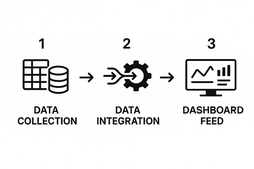
As the visual shows, that integration step is central. It's where the magic happens, turning chaotic data into something structured and useful.
For example, I once worked with a global manufacturer who implemented KPI dashboards to get a real-time view of their production line. Because their data was structured properly, managers could spot bottlenecks instantly and make decisions on the fly. This led to a direct and measurable increase in operational efficiency. That kind of control is only possible when you build on a solid data foundation.
Designing Compelling and Clear Visualizations

Now that your data is clean and organized, we get to the fun part: making those numbers talk. This is where you transform raw data into a story that delivers actionable insights at a glance. The goal isn't just to throw a bunch of charts onto a sheet; it’s about crafting a clear narrative that anyone can understand in seconds.
Effective visualization is what connects complex data to confident, quick decisions. It’s all about picking the right visual language to get your point across without any confusion. A poorly chosen chart can actually hide the truth, but the right one can make a critical trend jump right off the page.
Choosing the Right Chart for the Job
Your first big decision is matching the right chart type to each KPI. This is a critical step because different charts are built to answer different questions. Simply accepting Excel's default suggestions often isn’t the best approach. You need to think about what you're trying to show.
Here’s a quick guide based on what I’ve seen work best:
- Tracking Trends Over Time: The line chart is your go-to. It's unbeatable for showing things like monthly revenue, weekly website traffic, or daily user sign-ups, making it incredibly easy to spot trends.
- Comparing Different Categories: For this, you’ll want a bar chart or a column chart. They are perfect for comparing sales figures across different regions or seeing which marketing channels are bringing in the most leads.
- Showing Parts of a Whole: It can be tempting to use a pie chart here, but I’d advise against it. A stacked bar chart or even a simple table often shows proportions more clearly and accurately, avoiding the visual distortions that can make pie charts misleading.
If you want to go deeper into building visual reports, our detailed Excel dashboard tutorial covers more advanced techniques and examples. It’s a fantastic resource for really mastering visual storytelling within a spreadsheet.
Design Principles for a Clean Interface
With your charts selected, the next step is arranging them into a cohesive design. A clean, intuitive layout is what separates a dashboard that gets used from one that gets ignored. It's time to put on your designer hat and focus on creating a professional, uncluttered interface.
The key is to direct your audience’s attention to the most important information first. A logical layout prevents people from feeling overwhelmed and helps them focus on the metrics that actually matter.
A rule of thumb I always follow for effective dashboards is that less is more. Try to keep everything on a single screen with no more than nine distinct visuals. This forces you to be ruthless about what's important and keeps the focus on your core KPIs.
Here are a few design principles to live by:
- Strategic Use of Color: Color should communicate, not just decorate. Stick to a limited palette and use colors with intention. Think red for metrics that are off-target and green for those hitting their goals.
- Logical Layout: Most people read from top-left to bottom-right. Place your most critical, high-level KPIs in that top-left corner where the eye naturally lands first. Then, group related charts together to create logical, easy-to-scan sections.
- Clear Typography: Don't go crazy with fonts. Stick to one or two that are easy on the eyes. Use bolding and different font sizes to establish a clear visual hierarchy, so titles and key numbers pop.
Bringing Your Dashboard to Life with Interactive Elements

Let's be honest, a static report is a dead end. A truly useful KPI dashboard should feel more like a living tool, inviting people to poke around, ask questions, and explore the data on their own terms. The real magic happens when you build interactivity directly into your Excel file, transforming a simple presentation into a powerful analytical resource.
This is the feature that separates a good dashboard from a great one. It’s the difference between telling someone what happened and giving them the tools to discover why it happened. And the good news is, Excel has some fantastic built-in features that make this surprisingly easy to pull off.
Your Secret Weapons: Slicers and Timelines
The engine behind any truly dynamic Excel dashboard is the humble PivotTable. When you build your charts from PivotTables (these are called PivotCharts), you unlock the ability to filter and slice your data with a single click. Slicers and Timelines are the polished, user-friendly controls that bring this capability to the forefront.
- Slicers: Think of these as stylish, interactive buttons for your data. You can create a slicer for each sales region, product line, or marketing channel. Clicking a button instantly filters every connected chart to show data only for that specific selection. It’s incredibly intuitive.
- Timelines: This is a special kind of slicer built just for dates. It gives you a clean, visual timeline that lets anyone effortlessly zero in on specific years, quarters, months, or even days without wrestling with clunky filter menus.
Putting these tools on your dashboard completely changes the experience from passive viewing to active, hands-on exploration.
A pro tip I've learned over the years: you can connect a single Slicer to multiple PivotTables. This lets you control the entire dashboard from one spot, creating a seamless experience where every visual updates in perfect sync.
Building the Dynamic Engine
The process itself is refreshingly straightforward. For each key KPI you want to visualize, start by creating a PivotTable. From that PivotTable, you can then generate a corresponding PivotChart. Once you have your charts arranged on the dashboard, you just insert a Slicer or Timeline for any field you want to filter by—something like "Region" or "Order Date."
This isn't just a neat trick; it has real-world applications. I once worked with a travel company that built a KPI dashboard to monitor booking cancellation rates. When they saw a sudden spike, the interactive dashboard allowed them to instantly filter down to the specific destination, see the trend clearly, and start investigating the root cause in minutes, not hours.
Interactivity is a fundamental part of good dashboard design. To dig deeper into creating visuals that are both beautiful and effective, take a look at our guide on data visualization best practices. Making your dashboard dynamic doesn't just make it look more impressive; it multiplies its value by empowering your team to find their own answers. This is a crucial step when learning how to create a KPI dashboard that actually drives curiosity and uncovers meaningful insights.
Got Questions About Building KPI Dashboards?
When you first start building KPI dashboards, you're bound to run into a few hurdles. It happens to everyone. Getting ahead of these common questions can save you a ton of headaches and help you create something genuinely useful right from the start.
Let's walk through some of the most frequent sticking points I've seen people encounter. Answering these now will keep your project moving and ensure it actually delivers the insights you're after.
How Can I Make My Dashboard Update Automatically?
Let's be honest, nobody wants to be the person manually copying and pasting data every Monday morning. It’s a surefire way to introduce errors and, frankly, it’s a colossal waste of time. The secret to automation in Excel is a fantastic tool called Power Query.
Think of Power Query as a direct pipeline to your data, whether it’s sitting in a CSV file, another spreadsheet, or a proper database.
You set up the cleaning and formatting steps just once. After that, you can either configure the connection to refresh automatically when the file is opened or just hit the 'Refresh All' button. Just like that, your dashboard is populated with the latest numbers without any of the manual grunt work.
What's the Single Biggest Mistake to Avoid?
I've seen this happen more times than I can count: the dreaded 'data dump.' It's the impulse to throw every single metric you have onto one screen, hoping that more data equals more insight. It doesn't. What you end up with is a cluttered, overwhelming mess that no one can make sense of.
A dashboard that tells you everything tells you nothing. Its power comes from focus and clarity, not from sheer volume.
Be ruthless about what makes the cut. For most dashboards, you should be aiming for 5-10 core KPIs that directly reflect your most critical business objectives. If a metric doesn't help a user make a specific, important decision, it doesn't belong on the main view.
What's the Best Way to Share My Dashboard?
Once you’ve built your masterpiece, you need to get it in front of the right people without it breaking. For straightforward team collaboration, saving the file to a shared space like OneDrive or SharePoint works perfectly. This ensures everyone is always looking at the most current version.
But you also want to protect all that work you put in. Use Excel’s built-in ‘Protect Sheet’ feature. This is a lifesaver. You can lock down all your formulas and charts while still allowing people to use interactive elements like Slicers and filters. This prevents someone from accidentally deleting a key formula.
If you need to share it more broadly with a non-technical audience, publishing it to a service like Power BI is another solid route to explore for web-based access.
Ready to make Excel do the heavy lifting for you? Elyx.AI plugs right into your spreadsheet, letting you clean data, find insights, and build formulas just by asking in plain English. Stop fighting with VLOOKUPs and start getting answers. See how it works at https://getelyxai.com.
Reading Excel tutorials to save time?
What if an AI did the work for you?
Describe what you need, Elyx executes it in Excel.
Sign up