Create Charts in Excel An Expert Guide

Staring at a spreadsheet full of numbers? The quickest way to create charts in excel is often to arrange your data neatly into columns and rows, select the cells you need, and let the Insert > Recommended Charts feature work its magic. This simple action can transform a wall of raw numbers into a clear, compelling visual story in just a few clicks.
From Raw Data to Revealing Visuals

Before you even think about hitting that 'Insert Chart' button, the most important work happens first: preparing your data. I can't stress this enough. A truly effective visual is built on a foundation of well-organized information. Think of it as laying the groundwork for a chart that doesn't just show numbers, but actually reveals insight.
Spending too much time on Excel?
Elyx AI generates your formulas and automates your tasks in seconds.
Sign up →This initial step is what separates a confusing, jumbled chart from one that tells a clear story. When your data is messy, Microsoft Excel gets confused. The result? Charts that misrepresent your message or just plain don't work.
Organizing Data for Clarity
The trick is to structure your data in a way that Excel can easily understand. Let’s say you're tracking monthly product sales. You’ll want to set up your spreadsheet with clear, simple headers that define what's in each column and row.
- Columns for Categories: Use your columns for the distinct things you're measuring. For example,
Column Amight be "Month,"Column Bfor "Product A Sales," andColumn Cfor "Product B Sales." - Rows for Data Points: Each row below the headers should then hold the data for a single entry or time period. So,
Row 2would have the sales figures for January,Row 3for February, and so on.
This clean, grid-like structure is the language Excel speaks best when it comes to charting. Stay away from things like merged cells, unnecessary blank rows, or multiple header lines within your data set. These are common culprits that trip up the charting engine.
One of the most frequent mistakes I see is people including "Total" or summary rows in their initial data selection. This can completely skew your chart's scale and throw everything off. Always chart the core data first. You can add totals later as a separate annotation if you need to.
Why This Matters in the Real World
A clean data setup is more than just good housekeeping; it’s about efficiency. When you create charts in Excel from well-organized data, the software automatically knows what to do. With the sales data we just described, Excel will instantly recognize "Month" as the horizontal axis and create separate, color-coded series for "Product A" and "Product B." No fuss, no manual corrections.
This simple bit of prep is a massive time-saver for professionals everywhere. Excel is a powerhouse tool, with an estimated user base of 1.1 to 1.5 billion people worldwide. As you can see from recent statistics on scottmax.com, a huge number of these users rely on it for reporting and data management. Taking a few moments to structure your data properly will save you a ton of frustration down the line.
Choosing the Right Chart for Your Data Story
With all the chart options in Excel, picking the right one can feel overwhelming. But it's not a guessing game. Think of this as your playbook for making strategic choices. Your goal isn't just to make a chart; it's to select the one that makes your data's story leap off the screen with absolute clarity.
The first, most crucial step is to figure out what you're trying to say. Are you showing how something has changed over time? Comparing different categories? Or maybe you're showing how different parts make up a whole? Each of these goals has a chart type that's perfectly suited for the job.
This image breaks down the decision-making process beautifully. It’s a great visual reminder of how to approach your chart selection.
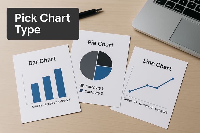
As the graphic shows, your choice really boils down to the narrative you want to build with your data.
Aligning Chart Type with Your Goal
To create charts in Excel that actually land with your audience, you have to match the visual to your analytical goal. A line chart, for instance, is the undisputed champion for tracking performance over a continuous period. Think monthly sales figures or website traffic over a year. That connecting line instantly shows momentum, trends, and patterns.
But what if you need to compare revenue across different product lines for the same quarter? A bar or column chart is a much better fit. The distinct bars give you a clean, side-by-side comparison, making it instantly clear which products are flying off the shelves and which ones are lagging behind.
Pro Tip: The best charts need the least explanation. If your audience has to squint and struggle to understand your visual, you've probably chosen the wrong one. A great chart simplifies the data, it doesn't make it more complicated.
To make this even more practical, I've put together a quick-reference table. Use this to find the right chart for what you're trying to show.
Matching Your Chart to Your Goal
Use this quick reference guide to select the most effective Excel chart based on what you want to communicate.
| Analysis Goal | Recommended Chart Type | Best Use Case Example |
|---|---|---|
| Track a trend over time | Line Chart | Showing monthly website traffic over the last 12 months. |
| Compare values across categories | Bar or Column Chart | Comparing quarterly sales figures for 5 different regions. |
| Show parts of a whole | Pie or Doughnut Chart | Illustrating the percentage breakdown of a marketing budget by channel. |
| Understand distribution | Histogram or Box Plot | Analyzing the distribution of customer ages or test scores. |
| Show relationships between variables | Scatter Plot | Seeing if there's a correlation between advertising spend and sales. |
This table should help you get started, but let's dive into a few more real-world situations.
Practical Scenarios for Chart Selection
Here are a few common business scenarios and the perfect chart for each one.
- Showing Market Share: Imagine you need to show how your company's market share stacks up against three key competitors. A pie chart is perfect for this. It’s an intuitive way to represent parts of a whole, making it immediately obvious how the market is divided.
- Tracking Project Progress: You're managing a project and need to visualize the composition of completed tasks across different phases (like Planning, Development, and Testing). A stacked column chart is your best friend here. Each column can represent a week or month, and the stacked segments show the proportion of work from each phase.
- Identifying Relationships: What if you want to know if there's a connection between your social media ad spend and the number of website conversions? A scatter plot is the go-to. It plots both variables on a graph, quickly revealing if there's a relationship or pattern you should know about.
Choosing the right visual is a huge part of good data analysis. The choice depends on your data and what you're trying to achieve—whether that’s finding a pattern, spotting an outlier, or even predicting a trend.
Ultimately, learning how to create charts in Excel is less about technical button-pushing and more about becoming a good storyteller. Before you even click "Insert Chart," just ask yourself: "What's the one thing I want my audience to take away from this?" Your answer will point you to the right visual every time.
For a deeper look into making sense of the numbers behind the charts, you might be interested in our guide on how to analyze data in Excel.
Building Your First Meaningful Chart
Alright, we’ve covered the groundwork of organizing data and picking the right kind of chart. Now it's time to roll up our sleeves and apply that knowledge. Let's walk through the entire process, starting with a raw table of numbers and ending with a clear, insightful visual that actually tells a story. You'll see just how simple it is to create charts in Excel once you have a solid process.
Let's put ourselves in the shoes of a marketing manager. You've got a simple table showing monthly website traffic, and your goal is to see if a new content strategy you launched is actually paying off.
Starting With a Practical Dataset
First things first, your data needs to be clean and simple, just like we discussed. In this scenario, you have one column for the months and a second for the website visits. It's perfectly set up and ready to go.
Here's the data we'll be working with:
| Month | Website Visits |
|---|---|
| January | 12,500 |
| February | 14,200 |
| March | 18,000 |
| April | 17,500 |
| May | 21,300 |
| June | 24,000 |
With the data organized like this, the next part is a breeze. All we have to do is show Excel what we want to visualize.
Selecting Your Data and Inserting a Chart
Start by clicking and dragging your mouse to highlight the entire data range, from cell A1 down to B7. Don't forget to include the headers—"Month" and "Website Visits." This is a pro-tip that saves a ton of manual work, as Excel will use them to automatically label your chart's axes.
Once your data is selected, look up at the Excel ribbon and click on the Insert tab. This is where all the magic happens for visuals. You'll spot a whole section just for charts, filled with little icons for bars, lines, pies, and more.
If you're new to this, the number of chart options can feel overwhelming. My go-to advice is to always start with Recommended Charts. It's easily one of Excel's most useful features, analyzing your data and suggesting the best chart types for the job.
Click on Recommended Charts, and a new window will pop up. Because our data shows a value changing over time, Excel is smart enough to suggest a line chart as its top pick. And it's right—a line chart is the perfect way to show a trend, which is exactly our goal here.
Making Initial Interpretations and Adjustments
Go ahead and select the line chart from the recommendations and hit OK. In a split second, Excel does its thing and drops a chart right onto your worksheet. You’ll see that it’s already figured out that "Month" belongs on the horizontal (X) axis and "Website Visits" goes on the vertical (Y) axis.
The rising line on the chart instantly gives you a visual win—you can see the upward trend, confirming your content strategy is working.
Technically, the chart is done. But we're not aiming for "technically done," we're aiming for "effective." The default title will be a placeholder like "Chart Title," which tells your audience nothing. A quick fix is to change it to something descriptive, like "Website Traffic Growth H1 2024."
This basic chart is your foundation. You’ve successfully turned a boring table of numbers into a visual story. The next step is to customize its look and feel to make it even clearer and more professional.
Making Your Charts Clear and Powerful
An out-of-the-box Excel chart is really just a starting point. The real value comes when you start tweaking and refining that visual to tell a compelling story with your data. A thoughtfully customized chart does more than just show numbers; it directs your audience's attention straight to the most important takeaways.
This is where you'll get cozy with the Chart Design and Format tabs. These are your command center for transforming a generic graph into something that's not only professional but also persuasive. It’s all about making small, intentional changes that have a huge impact on how your data is understood.
For instance, never settle for the default "Chart Title." It’s a wasted opportunity. A descriptive title like "Q3 Sales Performance: East vs. West" immediately tells your audience what they're looking at. The same goes for axis labels—without them, your chart is basically meaningless.
Getting a Handle on the Design and Format Tabs
When you click on your chart, you’ll notice two new tabs pop up in the Excel ribbon: Chart Design and Format.
Think of the Chart Design tab as your tool for making broad, sweeping changes. This is where you can change the entire look and feel in just a few clicks.
You can play around with different Chart Styles, which are pre-packaged designs. Some are clean and minimalist, while others are more stylized with shadows and 3D effects. I find these are a decent place to start, but the real power lies in customizing them further. This is also where you can swap out the entire color scheme to match your company's brand guide—a simple touch that instantly makes your work look more polished and official.
The Format tab, on the other hand, is all about the fine-tuning. This is for getting granular. Want to make just one bar in your chart a different color to highlight the top-performing product? Need to make the font on your legend a bit bigger for readability? The Format tab is where you do it.
One of the biggest mistakes I see is over-formatting. Remember, the goal is clarity, not visual chaos. Every color, border, or effect should serve a purpose, like highlighting a key data point. A chart that’s too "loud" will just distract from the message.
Calling Out Key Insights with Data Labels
One of the quickest ways to make your chart more effective is to add data labels. Instead of making your audience squint at the axis lines to estimate a value, you can put the numbers right where they belong—on the chart itself.
Just select your chart, click the little green plus icon (Chart Elements), and tick the box for Data Labels. From there, you can even format them to show percentages, category names, or whatever makes the most sense. I often use this to specifically call out the highest and lowest values in a data series. It’s a simple trick that makes the key takeaways impossible to ignore.
A Few More Advanced Tricks
Ready to take your charts from good to great? Here are a couple of my favorite advanced techniques that can add a whole new layer of insight.
-
Add a Trendline: If you have a bar or line chart that shows data over time (like monthly sales), adding a trendline is a fantastic way to show the big picture. It smooths out the day-to-day or month-to-month volatility and reveals the underlying trajectory—are things heading up, down, or staying flat? You can add one right from the Chart Elements menu to get an at-a-glance view of your data's momentum.
-
Use a Secondary Axis: Ever tried to plot two totally different types of data on one chart? Say, sales revenue (in millions of dollars) and units sold (in the thousands). Their scales are worlds apart. This is the perfect job for a secondary axis. It adds another vertical axis to the right side of your chart, letting you plot both datasets together in a single, powerful visual without one distorting the other.
Taking Your Excel Charts to the Pro Level
Alright, you've mastered the basics. Now, let's talk about the techniques that will make your data visualizations truly stand out. This is where you move from just making charts to crafting compelling, professional-grade insights that command attention.
One of the biggest time-savers I've learned is making charts that update themselves. The trick? Before you even think about creating the chart, turn your data range into an official Excel Table. It's incredibly simple: just click anywhere in your data and press Ctrl+T.
Once your data is in a Table, create your chart from it. From now on, any new rows of data you add will automatically appear in the chart. Gone are the days of manually resizing the source data range every single time you get updated figures. It’s a game-changer for recurring reports.
Building Powerful Combination Charts
Sometimes, one chart type just doesn't cut it. You have a story to tell that involves different kinds of data, and that's where a combination chart becomes your best friend. They let you layer multiple datasets onto a single visual, creating a much richer narrative.
Let's imagine a classic business scenario: you're tracking monthly sales revenue alongside the number of units sold. One is measured in dollars, the other in quantity. Putting them on the same axis would make one of them look flat and useless.
A combo chart solves this beautifully. You can:
- Show your revenue as columns.
- Overlay the number of units sold as a line.
- Add a secondary axis on the right side specifically for the unit count.
Suddenly, you can see the relationship between volume and revenue in one clear picture. Did that spike in units sold actually lead to a big jump in revenue, or was it a low-margin promotion? This is how you uncover deeper insights.
Eliminating Chart Junk for Maximum Clarity
Here's a principle that will instantly elevate your work: get rid of the "chart junk." This term was coined by the legendary data visualization expert Edward Tufte, and it refers to any visual fluff that doesn't help people understand the data. Think of heavy gridlines, goofy 3D effects, or distracting background colors.
The goal is to achieve the highest possible data-to-ink ratio. Every pixel should have a purpose. If a border, shadow, or color doesn’t add value or clarity, it's just noise. Get rid of it, and your message becomes stronger.
Color is another area where you can be more intentional. Don't just accept Excel's default palette. Use color with purpose. For instance, make most of your data series a neutral gray and use a single, bold color to highlight the one series you want everyone to focus on. This simple move immediately directs your audience's attention right where you want it.
This level of skill is exactly what separates an amateur from a professional, and it's a core competency tested in certifications like the Microsoft Office Specialist (MOS) exams. For years, these exams have required candidates to not only build charts but also customize them for impact. If you want a peek into how these skills are formally assessed, you can review the objectives from past Microsoft Excel exams on vula.uct.ac.za. Adopting these pro techniques will ensure your visuals aren't just seen, but truly understood.
Common Excel Charting Questions Answered
Even when you feel comfortable with the basics, you’re bound to hit a few snags when building charts in Excel. I get asked about these all the time. Let’s walk through some of the most common sticking points and how to solve them so you can get back to your analysis.
How Do I Create a Chart from Data on Different Sheets?
This is a frequent hurdle, and the answer isn't as straightforward as just holding Ctrl and clicking across tabs. Excel's charting engine needs its data in one continuous block.
The best practice here is to consolidate your data first. I always create a new, clean sheet specifically for this purpose—call it "Chart Data" or something similar.
From there, you have two choices. You can manually copy and paste the ranges you need from your source sheets into a single, unified table. Or, for a much more robust setup, use formulas like VLOOKUP or the more powerful INDEX/MATCH combo on this new sheet. These formulas will pull the data in for you, creating a live link back to the originals. When the source data changes, your chart updates automatically. No more manual work.
Why Is My Chart Not Updating with New Data?
Ah, the classic "I added a new month's sales, but my chart didn't notice" problem. The fix for this is surprisingly simple and incredibly powerful: convert your data range into an official Excel Table.
Before you even think about making a chart, select your data and hit Ctrl+T on your keyboard (or go to the Insert tab and click Table).
Once your data is in a Table, create your chart from it. Now, any time you add a new row of data to the bottom, the Table automatically expands, and so does your chart. This completely removes the tedious task of manually adjusting the chart's source data range every single time you get new figures.
Honestly, this
Ctrl+Tshortcut is one of the best habits you can build in Excel. It turns a static range into a dynamic, smart object, which not only solves the auto-updating chart issue but also makes sorting and filtering way more reliable.
What Is the Best Way to Share an Excel Chart?
You’ve built the perfect chart; now you need to get it in front of people. You have a few great options, and the best one really depends on the situation.
- For quick sharing in an email or a Word doc, just right-click the chart, select 'Copy', and paste it into your destination. You'll get a few paste options—you can embed it as a static picture or link it to the original Excel file, so it updates if the source data changes.
- For formal reports, a PDF is your best bet. It creates a professional, non-editable version that looks sharp and is universally accessible. Just select the chart, go to 'File' > 'Save As', and choose 'PDF' from the file type dropdown. This gives you a clean, high-resolution vector image of your chart that won't get fuzzy.
Ready to make creating and managing charts in Excel even easier? Elyx.AI integrates directly into your spreadsheet, allowing you to generate insights, create visuals, and clean data with simple, natural language prompts. Stop wrestling with formulas and start getting answers. Explore what's possible with AI at https://getelyxai.com.
Reading Excel tutorials to save time?
What if an AI did the work for you?
Describe what you need, Elyx executes it in Excel.
Sign up