7 Business Intelligence Dashboard Examples (With Screenshots)

In a data-driven world, the difference between market leaders and followers often comes down to one thing: clarity. Raw data is abundant, but actionable insight is rare. This is where a well-designed Business Intelligence (BI) dashboard becomes your most critical asset. It's more than just charts and graphs; it's a strategic command center that translates complex datasets into clear, concise narratives that drive smart decisions.
However, creating a dashboard that truly informs and empowers can be challenging. Many teams struggle with cluttered layouts, irrelevant metrics, and a lack of strategic focus, resulting in tools that are ignored rather than embraced. To help you avoid these pitfalls, we've curated a list of powerful business intelligence dashboard examples.
This guide moves beyond surface-level showcases to provide a deep strategic analysis of what makes each dashboard effective. We'll break down the design principles, key performance indicators (KPIs), and actionable takeaways you can replicate to build dashboards that don't just display data-they deliver results. Each example includes detailed screenshots and direct links to the source, giving you a blueprint for transforming your own BI strategy.
Spending too much time on Excel?
Elyx AI generates your formulas and automates your tasks in seconds.
Sign up →1. Tableau Public Gallery
Tableau Public Gallery is not just a single dashboard but a vast, interactive library showcasing the art of the possible in data visualization. It serves as an unparalleled resource for anyone looking for high-quality business intelligence dashboard examples. Instead of offering a static image, the gallery provides access to thousands of fully functional dashboards created by a global community of data enthusiasts, analysts, and professionals. This makes it an essential first stop for inspiration and practical learning.
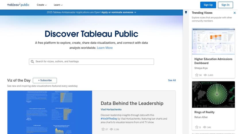
The platform’s core strength lies in its diversity and interactivity. Users can filter dashboards by category, explore trending visualizations, or dive into curated galleries like "Viz of the Day." This active community ensures the content is constantly refreshed, reflecting the latest trends in UI/UX design and data storytelling across every conceivable industry, from finance to healthcare and sports analytics.
Strategic Analysis & Actionable Insights
Tableau Public’s value proposition is its "show, don't just tell" approach. It allows you to deconstruct complex dashboards to understand the underlying data structure and design choices.
Key Takeaway: The gallery is a living textbook on data visualization. Use it to reverse-engineer successful dashboards by downloading the original Tableau workbook. This allows you to see the exact calculations, data joins, and formatting techniques used by expert creators.
Actionable Tips for Users:
- Filter for Relevance: Use the search and filter functions to find dashboards specific to your industry or use case (e.g., "sales KPI dashboard," "supply chain analytics").
- Analyze Layouts: Pay close attention to how creators organize information. Note the placement of key performance indicators (KPIs), the use of whitespace, and the logical flow of the narrative.
- Study Interactivity: Interact with filters, tooltips, and drill-down features to understand how they enhance user experience and provide deeper insights.
Platform Breakdown
| Feature | Description |
|---|---|
| Access & Cost | Completely free. Anyone can browse, view, and interact with the dashboards. Downloading workbooks requires a free Tableau Public account. |
| Unique Offering | The ability to download source workbooks provides an unmatched learning opportunity to see "behind the scenes" of a visualization. |
| User Experience | The interface is clean and intuitive, with powerful search and categorization features making it easy to find relevant examples. |
| Content Quality | While quality varies due to its user-generated nature, the "Featured" and "Viz of the Day" sections showcase exceptionally high-caliber work. |
Website: https://public.tableau.com/en-us/gallery/
2. Power BI Community Gallery
The Power BI Community Gallery is a dynamic and collaborative hub where users of Microsoft’s Power BI can share, explore, and download a wide variety of dashboards. Much like Tableau's gallery, this platform provides a rich source of business intelligence dashboard examples, but with a distinct focus on practical, community-driven solutions built specifically for the Power BI ecosystem. It's an excellent resource for finding functional templates that solve real-world business problems.
The gallery’s strength is its direct applicability. Users can find dashboards for everything from project management to financial analysis and immediately download the source .PBIX files. This active community forum not only showcases finished products but also hosts discussions, allowing users to ask questions and get feedback directly from the creators.
Strategic Analysis & Actionable Insights
The Power BI Gallery’s primary value lies in its role as a crowdsourced template library. It allows you to skip the initial design phase by starting with a pre-built, functional dashboard that you can customize for your own data and branding.
Key Takeaway: The ability to download the .PBIX source file is a game-changer for rapid development. Use the gallery to find a dashboard that is 80% of what you need, then adapt the data sources, DAX measures, and visual elements to fit your specific requirements.
Actionable Tips for Users:
- Look for High-Kudos Content: Sort or filter the gallery by "Kudos" (the community’s version of likes) to quickly find the most popular and well-regarded dashboards.
- Study the Data Model: Once you download a .PBIX file, open the "Model" view in Power BI Desktop. Analyze how the creator structured table relationships, as this is the foundation of a robust report.
- Engage with the Community: Don’t just download; read the comments. Often, creators and other users discuss challenges, share DAX formula variations, and offer tips for improving the dashboard.
Platform Breakdown
| Feature | Description |
|---|---|
| Access & Cost | Free to browse, download, and participate. A Power BI account is needed for engagement, and Power BI Desktop (also free) is required to open files. |
| Unique Offering | Direct access to downloadable .PBIX files allows for immediate customization and serves as an excellent learning tool for reverse-engineering DAX and models. |
| User Experience | The platform is integrated within the broader Power BI community forum, making it easy to transition from viewing a gallery item to asking a related question. |
| Content Quality | Quality can be inconsistent as it's entirely user-generated. Prioritizing dashboards with high engagement and detailed descriptions is recommended. |
Website: https://community.powerbi.com/t5/Data-Stories-Gallery/bd-p/DataStoriesGallery
3. InetSoft Technology
InetSoft Technology provides a curated gallery of business intelligence dashboard examples that showcase the capabilities of its proprietary BI software. Rather than a community-driven platform, this is a polished collection of design templates and functional demos. The examples cover a wide range of industries, demonstrating how InetSoft’s tools can be applied to specific use cases like finance, supply chain, and healthcare analytics.
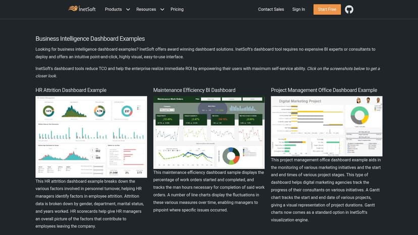
The collection's primary strength is its focus on clean, user-friendly design and the integration of interactive, real-time data. Each dashboard serves as a blueprint for building professional-grade reports. The examples highlight practical applications, from tracking manufacturing defects in real-time to visualizing complex financial performance metrics, offering a clear vision of what can be achieved with a dedicated BI solution.
Strategic Analysis & Actionable Insights
InetSoft's gallery is less about community inspiration and more about providing a professional design standard. It’s an excellent resource for teams looking to move beyond basic reporting tools and adopt a more sophisticated BI framework. For those who still rely heavily on spreadsheets, understanding the leap in functionality shown here is crucial; explore our Excel dashboard tutorial to see how to begin that transition.
Key Takeaway: Use these examples as a benchmark for professional BI design. The dashboards are built to be intuitive for non-technical users, demonstrating how to present complex data in a digestible and actionable format.
Actionable Tips for Users:
- Focus on UI/UX: Analyze the simple layouts, clear labeling, and intuitive navigation. These examples prioritize usability, which is key for broad user adoption.
- Identify Industry-Specific KPIs: Browse the gallery to find a dashboard relevant to your field and identify the key performance indicators they track. This can help validate or refine your own metric selection.
- Study Real-Time Elements: Look for examples with streaming data to understand how live information can be visualized to monitor operations and trigger immediate alerts.
Platform Breakdown
| Feature | Description |
|---|---|
| Access & Cost | The example gallery is free to browse. Accessing the full functionality to build or customize these dashboards requires purchasing InetSoft's software. |
| Unique Offering | The focus on clean, enterprise-ready templates provides a clear standard for professional dashboard design and functionality. |
| User Experience | The website presents the dashboards in a straightforward gallery format, making it easy to browse and find examples by industry or use case. |
| Content Quality | Quality is consistently high and professional, as all examples are created by InetSoft to showcase their platform's best features. |
Website: https://www.inetsoft.com/info/business_intelligence_dashboard_examples/
4. Qlik Business Intelligence Dashboard Examples
Qlik's gallery of business intelligence dashboard examples serves as a practical, educational hub for understanding how dashboards can be tailored to specific business functions. Unlike a purely visual showcase, Qlik focuses on demonstrating the strategic application of BI across departments like IT, sales, and marketing. It provides a comprehensive guide that not only displays finished products but also explains the underlying components and best practices for creating them.
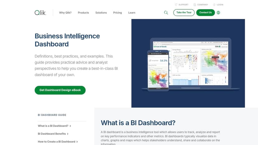
The platform's strength is its emphasis on role-specific solutions and multi-source data integration. Each example is designed to solve a particular set of business problems, showcasing how Qlik's associative engine allows users to explore data from different systems in a single, unified view. This approach helps users see how to move from siloed data points to holistic, cross-functional insights. To make the most of these examples, it's crucial to understand the principles of effective design. Learn more about data visualization best practices on getelyxai.com to better interpret and apply the concepts shown.
Strategic Analysis & Actionable Insights
Qlik’s examples are built to teach the "why" behind the "what." They illustrate how connecting disparate data sources, like CRM and ERP data in a sales dashboard, can uncover previously hidden relationships and drive more informed decisions.
Key Takeaway: Focus on the "how-to" aspect. Qlik's gallery is less about visual flair and more about functional design. Analyze how each dashboard is structured to answer specific questions for a particular job role, such as how an IT dashboard prioritizes system uptime and ticket resolution KPIs.
Actionable Tips for Users:
- Study by Function: Browse the examples categorized by job function to find a dashboard that aligns with your direct responsibilities and challenges.
- Identify Data Sources: Note which data sources are theoretically integrated in each example. This will help you plan your own data integration strategy.
- Evaluate Interactivity: While the examples are static images, the descriptions highlight interactive capabilities. Think about how filters and drill-downs could be applied to your own data sets.
Platform Breakdown
| Feature | Description |
|---|---|
| Access & Cost | The examples and educational content are free to view. Building and customizing these dashboards requires the Qlik Sense platform. |
| Unique Offering | Strong focus on role-based dashboard design and demonstrating the power of integrating data from multiple, disparate sources. |
| User Experience | The website is structured like an educational resource, clearly explaining dashboard components and benefits alongside visual examples. |
| Content Quality | The examples are high-quality, professional mockups designed to illustrate best practices rather than serve as live, interactive demos. |
Website: https://www.qlik.com/us/dashboard-examples/bi-dashboard
5. Etsy – Power BI Dashboard Templates
Etsy, a marketplace known for handmade and vintage items, has emerged as a surprising and valuable hub for practical business intelligence dashboard examples. Independent developers and data analysts sell pre-built, downloadable Power BI templates, offering a unique, cost-effective alternative to building dashboards from scratch. This approach provides small businesses and individual users with access to professionally designed reports tailored to specific niches like e-commerce, finance, and project management.
The platform’s strength is its accessibility and specialization. Instead of enterprise-level solutions, you find targeted templates for common software like QuickBooks, Google Analytics, or specific social media platforms. These templates are designed for immediate use, often including sample data and detailed instructions, which drastically lowers the barrier to entry for sophisticated business intelligence.
Strategic Analysis & Actionable Insights
Etsy democratizes BI by turning professional dashboard design into an affordable, off-the-shelf product. It allows users to bypass the steep learning curve and time investment required to create complex, visually appealing reports in Power BI.
Key Takeaway: Etsy is a template marketplace, not a BI platform. The value lies in acquiring a solid structural and visual foundation that you can then customize and connect to your own data sources. This is the fastest way to implement a polished dashboard.
Actionable Tips for Users:
- Review Seller Ratings: Vet sellers carefully by checking reviews, ratings, and the number of sales. Look for comments that mention ease of use and seller support.
- Check for Documentation: Prioritize templates that come with comprehensive user guides, video tutorials, or promised post-purchase support. This is crucial for connecting your data.
- Confirm Data Compatibility: Read the item description to ensure the template is compatible with your data source (e.g., Excel, SQL, specific APIs) and Power BI version.
Platform Breakdown
| Feature | Description |
|---|---|
| Access & Cost | Varies by seller. Templates are purchased via one-time payments, with prices typically ranging from $10 to over $100. |
| Unique Offering | Instant access to niche, pre-designed Power BI templates that can be implemented in hours rather than weeks, often for a very low cost. |
| User Experience | The standard Etsy marketplace experience. Filtering for "Power BI template" is straightforward, but quality and usability vary by seller. |
| Content Quality | Highly variable. Ranges from simple, single-page reports to complex, multi-page dashboards with advanced DAX calculations and data models. |
Website: https://www.etsy.com/market/powerbi_dashboard_template
6. DataCamp – Power BI Dashboard Examples
DataCamp positions itself as more than just a gallery; it's an educational launchpad that uses high-quality business intelligence dashboard examples as a gateway to skill development. It offers a curated collection of Power BI dashboards across domains like finance, sales, and healthcare, but its primary function is to bridge the gap between inspiration and practical application by integrating these examples directly with its learning curriculum.
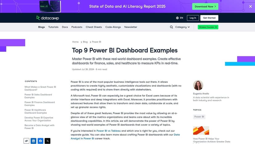
The platform’s strength is its contextual learning approach. Each dashboard example is accompanied by a detailed blog post that explains its purpose, the key metrics used, and the business questions it answers. This narrative provides crucial context that static images often lack, making it an excellent resource for beginners trying to understand the "why" behind the "what" of dashboard design.
Strategic Analysis & Actionable Insights
DataCamp’s value is in transforming passive viewing into an active learning journey. It connects the visual design of a dashboard to the specific Power BI skills required to build it, creating a clear pathway for professional development.
Key Takeaway: Use DataCamp’s examples as a blueprint for your learning plan. Identify a dashboard that aligns with your professional goals, study the breakdown of its components, and then use the linked courses to acquire the specific skills needed to replicate it.
Actionable Tips for Users:
- Deconstruct the Narrative: Read the accompanying text for each dashboard to understand the business logic. Note how the chosen visualizations directly address specific performance questions.
- Map Features to Skills: As you review a dashboard, identify features you can't replicate (e.g., a specific DAX measure, a complex slicer). Use the platform's resources to find courses that teach those exact techniques.
- Focus on Domain-Specific Metrics: Pay close attention to the KPIs used in examples relevant to your industry. This helps you learn the standard metrics and reporting practices for your field.
Platform Breakdown
| Feature | Description |
|---|---|
| Access & Cost | Viewing the dashboard examples and reading the blog posts is free. Accessing the full suite of related courses requires a DataCamp subscription. |
| Unique Offering | The direct integration of visual examples with structured, hands-on learning courses provides a complete "see it, learn it, build it" experience. |
| User Experience | The content is presented within a clean blog format. While not an interactive gallery, it's easy to navigate and digest the information provided. |
| Content Quality | The examples are professionally designed and well-documented, serving as reliable templates for best practices in Power BI. |
Website: https://www.datacamp.com/blog/9-power-bi-dashboard-examples
7. Hevo Data – Power BI Dashboard Examples
Hevo Data’s blog provides a curated collection of business intelligence dashboard examples, specifically tailored for users of Microsoft's Power BI. Rather than offering an interactive gallery, Hevo presents a detailed breakdown of top-tier dashboards across multiple industries. This resource is ideal for professionals seeking to understand the strategic thinking and data architecture behind effective Power BI implementations.
The platform’s main strength is its focus on the "why" behind each dashboard design. Each example, from finance to marketing and sales, is accompanied by an explanation of its objectives, key components, and the business questions it aims to answer. This approach emphasizes the importance of data integration and automation, showcasing how real-time data pipelines fuel insightful and responsive dashboards.
Strategic Analysis & Actionable Insights
Hevo’s content bridges the gap between seeing a great dashboard and understanding how to build one. It focuses on the foundational elements, such as data sourcing and integration, which are critical for creating reliable analytics. While many dashboards today are built with sophisticated BI tools, a significant amount of data preparation still happens in spreadsheets; you can discover more about how to analyze data in Excel to strengthen these foundational skills.
Key Takeaway: Hevo's examples teach that a dashboard's power comes from its data foundation. Focus on their explanations of data integration to understand how to connect disparate sources (like CRM, ERP, and marketing platforms) to create a single source of truth.
Actionable Tips for Users:
- Study the Objectives: For each example, first read the stated business objective. Analyze how the chosen KPIs and visualizations directly support that goal.
- Map Data Sources: Mentally map which data sources would be required to build a similar dashboard for your own organization. This helps in planning the data integration phase.
- Deconstruct Component Logic: Pay attention to Hevo’s descriptions of each dashboard component and replicate the logic in your own Power BI projects.
Platform Breakdown
| Feature | Description |
|---|---|
| Access & Cost | The blog post and all examples are completely free to access and read. No signup is required. |
| Unique Offering | Emphasizes the crucial role of data integration and ETL (Extract, Transform, Load) processes in building powerful, real-time dashboards. |
| User Experience | A standard blog format that is easy to read and navigate. The content is well-structured, with clear explanations for each dashboard example. |
| Content Quality | The examples are well-chosen and represent best practices in Power BI dashboard design for specific, high-value business use cases. |
Website: https://hevodata.com/learn/top-10-best-power-bi-dashboard-examples-in-2021/
Business Intelligence Dashboard Examples Comparison
| Example | Implementation Complexity 🔄 | Resource Requirements ⚡ | Expected Outcomes 📊 | Ideal Use Cases 💡 | Key Advantages ⭐ |
|---|---|---|---|---|---|
| Tableau Public Gallery | Medium – requires Tableau software | Moderate – Tableau Desktop needed | High-quality, interactive dashboards | Learning, inspiration, industry-wide BI visualization | Free access, vibrant community, diverse ideas |
| Power BI Community Gallery | Medium – needs Power BI Desktop | Moderate – Power BI Desktop required | Practical, customizable dashboards | Business-specific solutions, hands-on examples | Free, downloadable files, active support |
| InetSoft Technology | High – purchase software required | High – InetSoft BI platform | Industry-specific, real-time dashboards | Real-time data, streaming analytics, scalability | Real-time visualizations, user-friendly design |
| Qlik Business Intelligence Examples | Medium to high – Qlik software needed | High – Qlik platform | Educational, multi-source integrated BI | Learning dashboard best practices, multi-industry use | Comprehensive guides, interactive exploration |
| Etsy – Power BI Dashboard Templates | Low – ready-made templates | Low – purchase templates only | Quick deployment with limited customization | Fast setup, budget-friendly dashboards | Affordable, saves time, supports independent sellers |
| DataCamp – Power BI Dashboard Examples | Low to medium – learning focus | Low to moderate – subscription optional | Educational insights and inspirations | Skill development, understanding dashboard concepts | Educational integration, real-world applications |
| Hevo Data – Power BI Dashboard Examples | Low – informational only | Low – no software needed | Broad BI insights, best practice focus | Research, understanding data integration and automation | Industry diversity, integration emphasis |
Build Your Next Dashboard with Confidence and Clarity
The journey through these diverse business intelligence dashboard examples, from the community-driven galleries of Tableau and Power BI to the specialized templates on Etsy, reveals a powerful truth: a successful dashboard is far more than a collection of charts. It is a strategic tool meticulously designed to tell a clear, compelling story with data. The best examples we've explored are not just visually appealing; they are user-centric, intuitive, and laser-focused on answering the most critical business questions.
By analyzing the layouts, key performance indicators (KPIs), and interactive elements from platforms like InetSoft and Qlik, you have gained a blueprint for creating dashboards that drive action. The common thread connecting all effective dashboards is their ability to transform raw data into a strategic asset, making complex information accessible and actionable for everyone, from project managers to C-suite executives.
Core Principles for Effective Dashboard Design
To translate these examples into your own work, remember to prioritize the following principles:
- Audience First: Always begin with the end-user. What are their primary goals? What questions do they need answered instantly? A sales dashboard will have vastly different metrics and a different layout than a financial or marketing dashboard.
- Clarity Over Clutter: Resist the temptation to include every possible metric. The most impactful dashboards highlight a curated set of KPIs. Use whitespace, logical grouping, and a clear visual hierarchy to guide the user's eye to what matters most.
- Context is Crucial: Numbers without context are meaningless. Incorporate comparisons, trends, and targets to give your data significance. A metric showing "1,500 new leads" is good, but "1,500 new leads (a 25% increase from last month)" is a powerful insight.
Your Actionable Path Forward
Building on the inspiration from these business intelligence dashboard examples requires a practical, step-by-step approach. Start small by identifying a single, high-impact business problem you can solve with a focused dashboard. Define your key metrics, sketch a rough layout on paper, and gather feedback from stakeholders before you even open your BI tool.
However, the most sophisticated visualization tool is only as good as the data it receives. The foundation of every powerful dashboard is clean, accurate, and well-structured data. This initial preparation phase is where clarity is forged and where many projects stall due to manual, time-consuming tasks. This is particularly true for teams who rely on spreadsheets for their foundational data work.
The good news is that this foundational step can be significantly streamlined. By focusing on data integrity from the start, you ensure that the insights your dashboard presents are reliable and trustworthy. This allows you to spend less time on tedious data wrangling and more time on strategic analysis and building the compelling visualizations that empower your entire organization.
Ready to build your next BI dashboard on a foundation of clean, reliable data? Elyx.AI integrates directly into Excel and Google Sheets, using AI to automate data cleaning, analysis, and even in-sheet translation. Stop wrestling with messy data and start building dashboards with confidence by visiting Elyx.AI to see how you can streamline your workflow today.
Reading Excel tutorials to save time?
What if an AI did the work for you?
Describe what you need, Elyx executes it in Excel.
Sign up