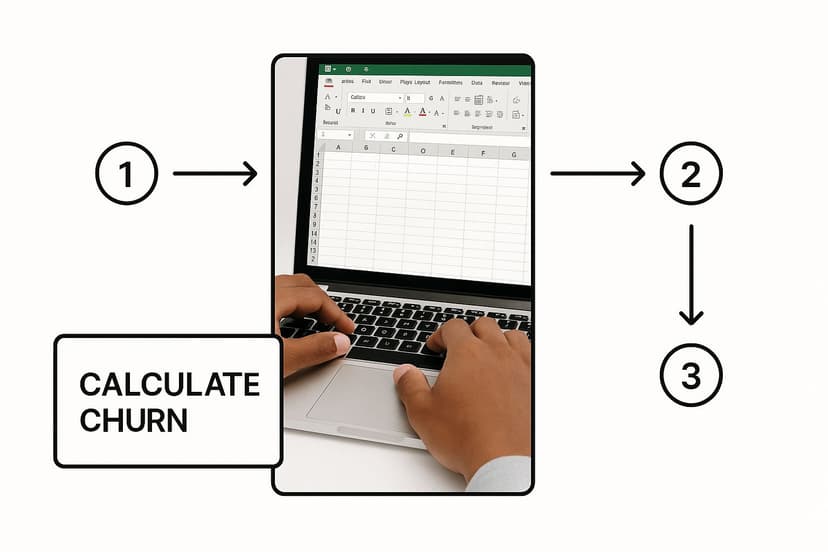
A Guide to AI-Powered Churn Rate Analysis in Excel

Churn rate analysis is the process of calculating the percentage of customers who stop using your service over a specific period. It's a critical health metric for any subscription-based business, as it directly reflects your ability to retain the customers you've worked so hard to acquire. This guide will walk you through how to perform a practical churn rate analysis in Excel, enhanced with the power of AI to make the process faster and more insightful.
Why Bother with Churn Rate Analysis in Excel?

Before diving into the Excel specifics, let's clarify what's at stake. Customer churn isn't just a metric on a dashboard; it's a direct threat to your revenue, marketing ROI, and brand reputation. Each lost customer represents not only forfeited recurring revenue but also the sunk cost of acquisition.
Spending too much time on Excel?
Elyx AI generates your formulas and automates your tasks in seconds.
Sign up →This analysis bridges the gap between raw data and the real-world health of your business. A seemingly small churn rate can quietly erode your growth potential. Think of it as a leaky bucket—you can pour new customers in, but you'll never achieve sustainable growth if existing customers are constantly slipping away.
The Real Cost of a Lost Customer
The financial impact of churn is significant. Globally, revenue loss from customer churn is projected to reach a staggering $782 billion by 2025. One of the most common and fixable causes is poor customer service. For instance, 68% of cancellations are attributed to slow response times. Customers waiting over two hours for support are four times more likely to leave. This creates a direct link between operational efficiency and customer loyalty. You can find more details about the financial impact of churn on SynthicAI.
This is precisely why a churn rate analysis is a strategic necessity, not just an accounting exercise. It helps you diagnose the root causes of customer loss by answering critical questions:
- Who is leaving? Are they new customers or long-time users? Do they belong to a specific demographic or business size?
- When are they leaving? Is there a spike in churn after the first month, or does it happen after a contract renewal period?
- Why are they leaving? What common behaviors or attributes do these churning customers share?
Shifting from Reactive to Proactive
Answering these questions transforms your strategy from reactive damage control to proactive retention. For example, discovering that customers on a specific subscription plan have a high churn rate is a clear signal to investigate that plan's pricing, features, or perceived value.
By identifying the patterns that precede customer churn, you empower your business to intervene at critical moments. This turns potential losses into opportunities for re-engagement and building stronger customer loyalty.
This is where Excel, supercharged with an AI tool like Elyx.AI, becomes an invaluable asset. Excel provides the structured environment to organize, calculate, and visualize your customer data, while an integrated AI assistant streamlines the entire process, making sophisticated analysis accessible to everyone.
Setting Up Your Data for Accurate Analysis in Excel
Any meaningful churn analysis is built on a foundation of clean, organized data. This preparatory step is not glamorous, but skipping it will render your results unreliable. The principle of "garbage in, garbage out" is especially true here.
Before you can identify trends or predict customer behavior, you need to collect the right data points and structure them in a way that Excel can understand.
Identifying the Must-Have Data Points
For a robust churn analysis in Excel, you need a few key columns in your dataset. While your business may track dozens of metrics, these are the essential starting points:
- Customer ID: A unique identifier for each customer.
- Subscription Start Date: The date the customer's subscription began.
- Subscription End Date: The date the subscription was cancelled. This will be blank for active customers.
- Plan Type: The specific subscription plan (e.g., Basic, Pro, Enterprise).
- Last Interaction Date: The last recorded activity, such as a login, feature usage, or support ticket.
Organizing your data with these columns is the first practical step. This structure allows you to calculate metrics like customer tenure and pinpoint the exact timing of churn, which is crucial for deeper analysis.
Dealing with the Inevitable Data Mess
Once you've imported your data into an Excel sheet, you'll likely encounter inconsistencies. Common issues include mixed date formats ("Jan 5, 2023" vs. "01/05/2023"), typos in plan names ("Pro Plan" vs. "proplan"), and empty cells that can disrupt calculations.
These small errors can break your formulas and Pivot Tables, leading to inaccurate conclusions. Cleaning and standardizing your data is therefore essential. While you could use native Excel functions like TRIM to remove extra spaces or PROPER to correct capitalization, creating formulas for every cleanup task is tedious, especially with large datasets.
The quality of your churn analysis is directly tied to the quality of your data preparation. Spending time cleaning and standardizing your dataset is the single most important investment you can make for generating trustworthy insights.
This is a perfect scenario where an AI assistant like Elyx.AI can save significant time and effort. Instead of searching for the right Excel function, you can simply describe your goal in plain English. For example, ask it to, "Standardize all dates in Column B to MM/DD/YYYY format," or "Remove all non-numeric characters from the Customer ID column." The AI will instantly generate the correct formula for you to apply.
This AI-driven approach is a massive time-saver, allowing you to focus on the analysis itself rather than getting bogged down in data preparation. For a deeper dive, our guide on how to clean data in Excel covers additional techniques.
With a clean, consistent, and complete dataset, you are finally ready to calculate your churn rate accurately.
Crunching the Numbers: Churn Rate Calculation in Excel
With your data prepared, it's time to transform those rows and columns into a single, powerful metric: your churn rate. This calculation provides a clear measure of customer retention.
The basic formula is straightforward:
Churn Rate = (Number of Customers Who Left in a Period / Total Customers at the Start of the Period) x 100
For example, if you started the month with 500 customers and 25 cancelled their subscriptions, your churn rate would be (25 / 500) x 100 = 5%. This percentage is your baseline for understanding customer loyalty.
The Old-School Way: Manual Excel Formulas
To calculate this manually in Excel, you would typically use functions like COUNTIFS or build a Pivot Table. This involves writing formulas to count the number of active customers at the beginning of a period and then counting how many of those customers have a "Subscription End Date" within that same period.
This method works, but it's prone to error. A small mistake in your formula—a misplaced comma or an incorrect cell range—can lead to inaccurate results, potentially causing you to make critical business decisions based on flawed data. A solid understanding of Excel functions is required to get it right consistently.
The Smarter Way: AI-Powered Formula Generation
Now, imagine simply telling Excel what you want to calculate in plain English. With an AI tool like Elyx.AI integrated into your spreadsheet, you can do just that. You bypass the complex syntax and simply state your objective.
For instance, you could type: "Calculate the churn rate for Q2, using the 'Start Date' in column C and 'End Date' in column D."
Elyx.AI interprets this instruction and generates the correct, ready-to-use Excel formula. This approach dramatically reduces the risk of manual error and saves the time you would otherwise spend writing and troubleshooting formulas, allowing you to get to insights faster.
This infographic illustrates the simplicity of the AI-powered approach.
As you can see, AI transforms a technical task into a simple, conversational one.
Let's compare these two methods to highlight the difference in efficiency and required skill.
Churn Rate Calculation Methods in Excel
| Aspect | Manual Excel Formula | AI-Powered Method (Elyx.AI) |
|---|---|---|
| Process | Manually write complex formulas using functions like COUNTIFS, SUMIFS, and date logic. |
Describe the desired calculation in natural language (e.g., "churn rate for May"). |
| Speed | Can be slow, especially with complex date ranges or multiple conditions. | Almost instantaneous generation of the correct formula. |
| Accuracy | Prone to syntax errors, incorrect cell references, and logical mistakes. | High accuracy, as the AI handles the complex syntax and logic for you. |
| Required Skill | Requires intermediate to advanced knowledge of Excel functions and formulas. | Minimal technical skill needed; just the ability to describe the goal. |
Using an AI formula generator is about maximizing efficiency. It frees you from the mechanics of Excel so you can focus on interpreting what your data is telling you.
Comparing Monthly vs. Annual Churn with AI
Consider a common business request: comparing the churn rate for last month to the rate for the entire year to date.
Manually, this would require building two distinct and complex formulas, carefully adjusting date ranges and logic for each.
With an AI assistant, the process is simple:
- For monthly churn: Ask, "What is the churn rate for May 2024?"
- For annual churn: Follow up with, "Now calculate the annual churn rate for 2024."
The AI understands the context and instantly provides the appropriate formula for each request. This flexibility is a game-changer for analyzing churn across different timeframes without needing to be an Excel formula expert.
The real power of using AI for formulas isn't just about saving time. It’s about empowering you to ask bigger, more interesting questions of your data. You can stop worrying about how to build the formula and start focusing on what insights you want to find.
It’s important to remember that a "good" churn rate varies by industry. While the average annual churn rate is often between 1% to 5%, sectors like Digital Media may see rates around 6.5%, while B2B SaaS businesses might aim for closer to 3.5%. Industry benchmarks help put your numbers in context.
A precise churn calculation is also the foundation for predictive analysis. To learn more about forecasting, our guide on what is regression analysis is a great next step. With your churn rate accurately calculated, you're ready to visualize these trends and inform your retention strategy.
Seeing the Story in Your Churn Data with Excel

A churn rate of 5% is just a number until you see it visualized as a trend line creeping up month after month. Data visualization is a critical step in any churn rate analysis because it turns abstract numbers into a compelling story.
When you transform raw data into charts and graphs in Excel, hidden patterns and trends become immediately apparent. Effective visuals make complex data accessible to everyone, from your marketing team to the C-suite.
Turning Numbers Into a Narrative
A line chart is the ideal starting point for visualizing churn over time. It’s a simple and effective way to track your churn rate on a daily, weekly, or monthly basis. Plotting this metric reveals seasonality, sudden spikes, or a gradual increase that requires attention. For example, a recurring peak in churn every third quarter might prompt questions about customer budget cycles or competitor promotions—insights that would otherwise remain buried in the data.
Bar charts are perfect for comparing churn across different customer segments. They help answer critical questions like:
- Do customers on our "Pro" plan churn more frequently than those on the "Basic" plan?
- Is our churn rate higher in Europe compared to North America?
- Do customers acquired in the last six months churn faster than long-term users?
When one bar stands out, it provides a clear signal, pointing you directly to the segments that need the most attention.
Go a Step Further with Interactive Dashboards
While static charts are useful, an interactive dashboard in Excel takes your analysis to the next level. By combining PivotCharts and Slicers, you can create a dynamic tool for exploring your data. Slicers are user-friendly filter buttons that allow you and your stakeholders to segment the data on the fly.
Imagine a dashboard where you can instantly filter churn data by subscription plan, customer tenure, and acquisition channel simultaneously. This setup enables you to drill down into the data and uncover the subtle relationships driving churn.
A well-built visual dashboard turns you from someone who just reports on data into a data storyteller. It gives you the power to answer follow-up questions in real-time, making your analysis far more credible and impactful.
However, building effective PivotCharts and configuring slicers can be intimidating for those who aren't Excel experts. Structuring the data correctly and selecting the right fields often involves a frustrating process of trial and error.
Let AI Recommend the Best Chart for You
This is where an AI tool like Elyx.AI can be a game-changer. Instead of struggling to build the right visualization, you can simply highlight your data and ask the AI for assistance.
A simple prompt like, "Create a line chart showing the monthly churn rate from the data in column F," will instruct Elyx.AI to generate a formatted chart ready for your report.
Even better, the AI can suggest the most effective way to present your findings. If you ask, "What's the best way to visualize churn by customer segment?" the AI can analyze your data and recommend the ideal chart type—be it a stacked bar chart, a pie chart, or another visual. This removes the guesswork and ensures your visualizations are clear, accurate, and impactful.
Turning Your Analysis Into a Retention Strategy
https://www.youtube.com/embed/z42UZpE5jys
You've calculated the numbers and created compelling charts. Now comes the most important part: translating those insights into a concrete action plan to improve customer retention. This is the moment you transition from data analyst to data-driven strategist.
The Pivot Tables and graphs you've built in Excel are telling you a story. Your task is to interpret it. What is the narrative behind that Q3 churn spike? Why are customers on your "Basic" plan churning at twice the rate of "Pro" users? These are not just statistics; they are symptoms of underlying problems. The goal is to move beyond the what and uncover the why.
Asking the Right Questions to Uncover the "Why"
To find the root cause, you need to ask targeted questions based on what your Excel dashboard reveals. Approach it like a detective following clues.
Here is a practical framework for this investigation:
- Isolate the Churn Event: Pinpoint where the problem is most acute. For example, your bar chart might show that customers acquired from a specific ad campaign churn at a 30% higher rate.
- Hypothesize the Cause: Brainstorm potential reasons. Did the campaign set unrealistic expectations? Was the onboarding process confusing for this particular audience?
- Validate with More Data: Test your hypothesis. You can segment the data further in Excel, but often the most valuable insights come from qualitative feedback. Send a targeted survey or conduct interviews with a few churned customers to understand their experience.
This process transforms abstract data into actionable intelligence. For instance, you might discover that customers who don't use a key feature within their first week are three times more likely to churn. That is a golden insight.
Connecting Your Excel Analysis to Concrete Retention Strategies
Once you understand the "why," you can develop targeted strategies. Your Excel analysis serves as the blueprint, ensuring you focus your resources where they will have the greatest impact.
For example, if your analysis reveals a high churn rate among new users in their first 30 days, this points to a weakness in your onboarding process. A clear retention tactic would be to improve that experience with in-app tutorials, proactive check-in emails, or a dedicated onboarding webinar.
The ultimate goal of churn rate analysis is not just to report a number but to create a feedback loop. Your data identifies a problem, you implement a solution, and then you measure the impact on your churn rate, starting the cycle anew.
Similarly, understanding your most loyal customers is equally important. Using techniques from customer segmentation analysis, you can identify the characteristics of your ideal customers and refine your marketing efforts to attract more of them.
The table below shows how to translate common findings from your churn analysis into specific, actionable retention strategies.
Actionable Retention Strategies Based on Churn Insights
| Common Churn Driver | Potential Retention Tactic |
|---|---|
| High churn within the first 30 days | Improve the onboarding experience (e.g., in-app guides, welcome emails, setup calls). |
| Low usage of a key product feature | Launch an educational campaign or webinar showcasing the feature's value. |
| Customers on a specific pricing plan leaving | Review the plan's value proposition or offer a small incentive to upgrade. |
| Spike in churn after a price increase | Communicate the value justification more clearly; offer a loyalty discount to long-term customers. |
| Users from a certain marketing channel churn faster | Re-evaluate the messaging of that channel to ensure it sets realistic expectations. |
This data-backed approach helps you move away from generic tactics and create personalized interventions that actually work. For more proven methods, check out these 7 Proven Strategies to Reduce Churn Rate. This is how a simple Excel spreadsheet, powered by smart analysis, becomes a core component of your company's growth engine.
Got Questions About Churn Analysis?
Even with a step-by-step guide, questions often arise when you begin analyzing your own data. Here are answers to some of the most common ones to help you achieve clear and trustworthy insights.
What's the Real Difference Between Churn and Attrition?
This is a common point of confusion. While churn rate and attrition rate are often used interchangeably, they have distinct meanings.
- Churn Rate applies when a customer makes a conscious decision to end their relationship with your business, such as actively canceling a subscription. This is the primary metric for SaaS, media, and telecom companies where there is a formal service agreement.
- Attrition Rate is more passive and typically used in non-contractual business models. It describes customers who simply stop engaging without a formal cancellation. For example, a regular customer at a local coffee shop who hasn't visited in three months is an instance of attrition.
Your calculation method in Excel will differ. Churn is tracked using a clear "Subscription End Date." For attrition, you must define what "inactive" means for your business—is it 90 days without a purchase? Six months? This definition is crucial for accurate measurement.
How Often Should I Actually Run This Analysis?
The ideal frequency depends on your business model and sales cycle. A common mistake is to over-analyze daily fluctuations, which are often just statistical noise. Here is a practical schedule:
- Monthly: This is the sweet spot for most subscription businesses. It provides a regular pulse on customer retention without overreacting to minor dips.
- Quarterly: A quarterly review is perfect for identifying broader trends and aligning your retention strategy with larger company goals.
- Annually: An annual review serves as a long-term health check. It's too infrequent for tactical adjustments but essential for strategic planning and calculating customer lifetime value.
If there's one piece of advice I can give, it's this: avoid the temptation to check churn daily. You'll end up making reactive decisions based on statistical noise. Stick to a consistent monthly or quarterly schedule for insights you can actually act on.
Can AI Really Tell Me Who Is Going to Churn?
Yes, but it's less like a crystal ball and more like a sophisticated weather forecast—it's about probability.
Predictive churn models use AI to analyze your historical data and identify the subtle behavioral patterns of customers who churned. These patterns might include a drop in product usage, fewer support tickets, or late payments. The AI learns these signals and then scans your current customer base to assign each a "churn risk score."
Building a predictive model from scratch in Excel is an advanced task, but the churn analysis you've already done is the critical first step. Tools like Elyx.AI can help you quickly segment customers to find at-risk groups, which forms the foundation for any predictive effort. You first need to identify the warning signs.
This is where the real power lies. Instead of waiting for a cancellation email, your team can proactively reach out to high-risk customers with helpful content or a special offer, giving you a chance to save the relationship before it's too late.
Ready to stop wrestling with formulas and start finding answers? With Elyx.AI, you can turn your spreadsheet into a seriously powerful analytics tool. Generate formulas, build charts, and clean up your data just by asking in plain English. Try Elyx.AI for free today and see for yourself how much easier churn analysis can be.
Reading Excel tutorials to save time?
What if an AI did the work for you?
Describe what you need, Elyx executes it in Excel.
Sign up