Creating Pivot Tables in Excel A Practical Guide

Creating a pivot table in Excel is surprisingly straightforward. You just select your data, head over to the Insert tab, and click PivotTable. From that simple starting point, you can drag and drop different data fields to instantly summarize, group, and analyze your information—all without writing a single complex formula.
What Makes Pivot Tables So Essential?
Before we jump into the step-by-step process of building one, it's worth taking a moment to appreciate why pivot tables are such a fundamental tool for anyone working with data. They're not just another feature; they're your secret weapon for turning dense, overwhelming spreadsheets into clear, actionable reports.
Imagine you're looking at a spreadsheet with thousands of rows of sales data. How do you quickly figure out which products are selling best in the North region? Or which sales representative had the highest numbers last quarter? Without pivot tables, you'd be stuck with hours of manual sorting, filtering, and formula-writing. With them, you can find those answers in seconds.
Spending too much time on Excel?
Elyx AI generates your formulas and automates your tasks in seconds.
Sign up →That's the real magic: turning raw, messy data into meaningful insights that help you make better decisions.
From Data Overload to Crystal Clear Insights
The core strength of a pivot table lies in its ability to reorganize—or "pivot"—your data on the fly. This dynamic quality lets you look at your dataset from multiple angles without ever touching or risking your original source data.
- Summarize massive datasets: Instantly condense thousands of rows into a neat, readable summary.
- Spot trends and outliers: Easily identify patterns, top performers, or anomalies that would otherwise be buried in the numbers.
- Drill down to find answers: Effortlessly filter, sort, and group your information to answer very specific questions.
A pivot table elevates you from a data janitor to a data strategist. Instead of just cleaning and organizing, you're interpreting the big picture and driving decisions.
Here's a quick look at the core benefits that make pivot tables an indispensable Excel skill for anyone working with data.
How Pivot Tables Transform Your Workflow
| Benefit | Real-World Impact |
|---|---|
| Speed & Efficiency | Slashes the time it takes to create summary reports from hours to minutes. |
| Dynamic Analysis | Explore different "what-if" scenarios by simply dragging and dropping fields. |
| Accuracy | Eliminates the risk of human error from manual calculations and data copying. |
| Clarity | Presents complex data in an easy-to-understand, professional format for presentations. |
Ultimately, learning to use pivot tables well means you spend less time wrestling with your data and more time understanding what it's telling you.
A Proven Tool for Productivity
Pivot tables have been a cornerstone of business analysis for decades for a good reason. They were first introduced way back in Excel 5.0 in 1994 and completely changed how professionals handled large datasets. Their impact is still massive today. Recent surveys of business intelligence experts show that over 70% use pivot tables regularly for reporting and quick analysis.
Why? Because they are proven to reduce the time spent on data summarization by up to 80% compared to manual methods. If you're curious about the history and impact of this feature, you can learn more about these powerful analytical tools on YouTube.
For anyone who touches data in their job, mastering this one skill is a non-negotiable for boosting productivity and unlocking a deeper understanding of your information. To explore other powerful techniques, be sure to check out our complete guide on how to analyze data in Excel.
Preparing Your Data for a Perfect Pivot Table
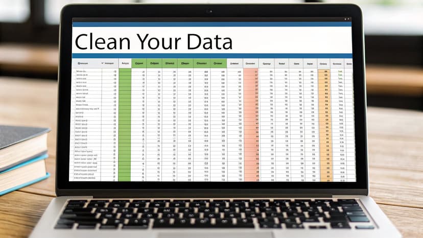
A great pivot table starts with clean data—there's simply no way around it. Before you even think about building your report, you have to get your source data structured correctly. Honestly, getting this part right is the difference between a quick, seamless analysis and a frustrating afternoon spent troubleshooting.
I like to think of the source data as the foundation of a house. If that foundation is cracked or uneven, the whole structure you build on top of it will be unstable. The same exact principle applies here; reliable insights can only come from clean, well-organized data.
The Non-Negotiable Rules of Data Structure
Your data needs to be in what we call a proper tabular format. This just means organizing it into neat columns and rows without any funky structural issues. Pivot tables are incredibly powerful, but they aren't mind readers. They absolutely depend on a predictable structure to understand how you want to slice and dice the information.
Here are the core rules I follow every single time:
- A Single Header Row: Your table must have one—and only one—header row right at the top. Each column needs a unique, descriptive name that isn't blank. Think "Sale Date," "Product Category," or "Revenue."
- No Blank Rows or Columns: Scan your dataset to make sure there are no entirely blank rows or columns hiding in the middle. A single empty row can trick Excel into thinking your data range has ended, causing it to ignore everything that comes after.
- Avoid Merged Cells: I know merged cells look nice for centering titles, but for a pivot table, they're a complete nightmare. Before you do anything else, make sure you unmerge any and all merged cells, especially in your header or data area.
The goal is to create a simple, flat table. Every single row should represent a unique record, and every column should hold a specific attribute for that record. Nailing this clean structure is the secret to creating pivot tables in Excel without running into errors.
Cleaning Up a Messy Dataset
Let's be real—data from the real world is rarely perfect. It often comes loaded with extra spaces, inconsistent formatting, or information crammed into one column that really needs to be separated. Taking a few moments to clean things up is a non-negotiable first step.
For example, you might get a "Full Name" column but need to analyze sales by last name. Or maybe an export from another system left annoying leading or trailing spaces that are preventing names or categories from grouping correctly.
Here are two of my go-to tools for fixing these common messes:
1. The TRIM Function: This function is an absolute lifesaver for getting rid of extra spaces. If names like " John Smith " are causing duplicates in your report, just use the formula =TRIM(A2) in a new column. It cleans them up instantly.
2. Text to Columns: This feature is brilliant for splitting one column into several. If you have "City, State" stuck together in a single cell, you can use Text to Columns to quickly break them into two distinct fields. This immediately unlocks the ability to do geographic analysis.
By investing just a few minutes in data prep, you set the stage for a powerful and, more importantly, accurate analysis. It makes the entire process of creating your pivot table in Excel a whole lot smoother.
Building Your First Meaningful Pivot Table
Okay, you've put in the work to clean up your data. Now for the fun part. This is where we stop prepping and start analyzing—transforming that flat spreadsheet of raw numbers into a dynamic report that actually answers questions.
Let's walk through this with a common real-world scenario: a basic sales dataset.
The whole process kicks off with a single click. As you'll see in Microsoft's own guidance on pivot tables, it's all about selecting your data and hitting the Insert tab. Newer tools like Copilot in Microsoft 365 can even build these from simple text prompts, but learning the manual process is a crucial skill.
This image shows the very first step—that simple click is the gateway to unlocking your data's potential.
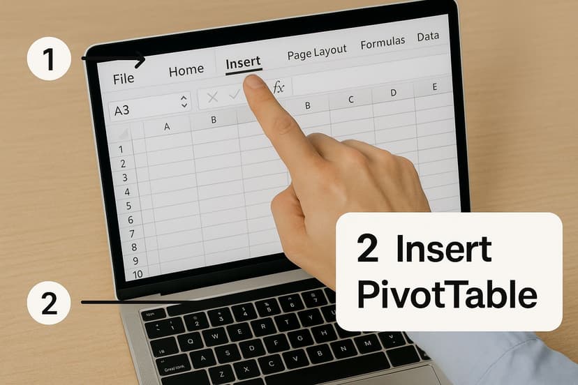
Navigating the Insert PivotTable Menu
First, find your clean data table and click any single cell inside it. Don't bother highlighting everything; Excel is smart enough to detect the entire range, provided you don't have any completely blank rows or columns breaking it up.
From there, head up to the Insert tab on the ribbon and click the PivotTable button.
A small dialog box will pop up, asking two key questions:
- Select a table or range: Excel almost always gets this right, pre-filling the range it detected. I always give the "marching ants" border a quick glance to make sure it's wrapped around my entire dataset.
- Choose where you want the PivotTable to be placed: You can pop it into an Existing Worksheet or a New Worksheet. Here’s my advice, learned the hard way: Always choose a New Worksheet. This creates a clean separation between your raw data and your analysis, which seriously cuts down on clutter and prevents you from accidentally messing with your source numbers.
Click OK. Excel will whisk you away to a new sheet with a blank report placeholder on the left and your control panel, the PivotTable Fields pane, on the right.
The PivotTable Fields Pane Explained
This pane is where all the magic happens. It’s your command center. At the top, you'll see a list of all the column headers from your data. Below that are four empty boxes. The entire art of building a pivot table is just dragging and dropping those fields into these four areas.
- Filters: Drag a field here to apply a high-level filter to the entire report. For instance, dropping a "Year" field here lets you toggle your whole analysis between 2023 and 2024 sales with a single click.
- Columns: Fields placed here create the column headers across the top of your report. This is the horizontal story of your data.
- Rows: Fields here become the row labels down the left side, giving your report its vertical structure. This is perfect for categories you want to compare, like "Product Name" or "Sales Rep."
- Values: This is where the math happens. Any field with numbers you want to calculate—like "Revenue" or "Units Sold"—goes here. Excel automatically summarizes it, typically by adding them up (Sum).
Think of it like building with LEGOs. The fields are your blocks, and the four areas are the different ways you can connect them. The combination you choose determines what your final report looks like and what story it tells.
Let’s make this tangible. Using our sales data example, drag the "Region" field into the Rows area. Instantly, your blank report populates with a unique list of every sales region from your data.
Now, drag "Product Category" into the Columns area. See how you've created a grid?
Finally, let's give that grid some meaning. Drag the "Sales Amount" field into the Values area. Boom. Just like that, you've created a powerful summary showing total sales for each product category, broken down by region. You've successfully turned a thousand rows of individual transactions into a clear, strategic overview in seconds.
Customizing Your Pivot Table for Clearer Insights

A basic pivot table is a great starting point, but a well-customized one is where the real magic happens. Think of the default pivot table as a rough draft—it has the core information, but it's not quite ready to present. Customizing it is how you turn a dense block of numbers into a clear, compelling story that answers specific questions.
This is the step where you polish your report, improve its readability, and really focus the analysis. It’s a crucial part of making your pivot tables truly powerful.
Changing the Summary Function
When you drag a field with numbers into the Values area, Excel's default move is to Sum everything up. That’s perfect for seeing total revenue, but what if you need to know the number of individual sales? Or maybe the average sale price per transaction?
Luckily, changing this is simple. Just right-click on any value in the summary column and hover over Summarize Values By. You’ll see a list of other powerful calculation options.
- Count: This is your go-to for tallying the number of entries. It’s perfect for getting a headcount of employees by department or counting how many sales orders came from each region.
- Average: Need to find the average transaction size or the average score on a test? This function does the math for you instantly.
- Max/Min: These are brilliant for quickly identifying outliers. Find your highest-performing product or your lowest sales day with a single click.
Switching the summary function lets you ask completely different questions of your data, all without building a new table from scratch.
Formatting for Readability and Impact
A number like 15432.987 isn't just ugly; it’s hard to process quickly. Proper formatting immediately makes your report look more professional and helps your audience absorb the information at a glance. Just select the numbers you want to fix, right-click, and choose Number Format. Here, you can add currency symbols, insert comma separators, and control the decimal places.
Don’t underestimate the power of good formatting. A clean, well-organized report is far more credible and ensures your key takeaways don't get lost in a sea of messy numbers.
Another quick win is sorting. Want to see your best-selling items listed first? Right-click on the sales column and select Sort > Largest to Smallest. In seconds, you’ve reordered the entire report to put the most important data right at the top.
Introducing Slicers and Timelines
Traditional filters get the job done, but if you want to make your report interactive, Slicers and Timelines are absolute game-changers. They transform a static report into a dynamic dashboard that even a non-Excel user can explore with ease.
You'll find these tools on the PivotTable Analyze tab.
- Slicers are essentially sleek, visual buttons for your filters. Instead of a clunky dropdown menu for "Region," you can create a slicer with clickable buttons for "North," "South," "East," and "West." They’re incredibly intuitive and fantastic for presentations.
- Timelines are specialized slicers built just for date fields. They give you a beautiful, scrollable timeline that lets you filter your data by years, quarters, months, or even specific days.
Using these tools makes data exploration feel less like work and more like a conversation. They empower your audience to dig in and find their own insights, leading to a much richer analysis for everyone involved.
Taking Your Pivot Tables to the Next Level
Once you've got the basics down, you're ready to dig into the features that really separate the pros from the amateurs. This is where you move beyond simple sums and counts and start making your data tell a story. These techniques let you invent new metrics, reframe your analysis on the fly, and find insights you'd otherwise miss—all without ever messing with your original source data.
This is the good stuff. It's how you stop just reporting numbers and start building a real narrative.
Create New Metrics with Calculated Fields
Ever found yourself needing a metric that just isn't in your dataset? Maybe you have columns for "Revenue" and "Cost," but what you really need to analyze is "Profit Margin." Instead of the hassle of adding a new column to your source sheet and then refreshing everything, you can use a Calculated Field.
This is one of my favorite features. It lets you create brand new, dynamic data points by applying formulas to your existing pivot table fields. It’s perfect for on-the-fly calculations like:
- Profit Margin:
=(Revenue - Cost) / Revenue - A 5% Commission:
=Sales * 0.05 - Average Order Value:
=Total Sales / Number of Orders
To build one, just click inside your pivot table, head over to the PivotTable Analyze tab, and find Fields, Items, & Sets > Calculated Field. Give your new field a name, punch in the formula, and you're done. Your analysis stays clean, contained, and incredibly flexible.
Group Data for a Bird's-Eye View
Sometimes, your data is just too detailed. A day-by-day list of sales is fine, but seeing that same data grouped by month or quarter? That's where strategic insights live. For this, the Grouping feature is your best friend.
Just right-click any date in your Rows or Columns area and choose Group. A handy little dialog box pops up, letting you instantly roll up those dates into years, quarters, months, or whatever you need. The same principle works for numbers, too—you can create custom bins for things like age demographics or price ranges.
This one simple action can turn a messy list of dates into a clean, professional timeline. Suddenly, spotting seasonal trends or quarterly performance is a piece of cake.
Reframe Your Analysis with Show Values As
The Show Values As feature might be the most powerful, yet most overlooked, tool in the entire pivot table toolkit. With just a few clicks, you can completely change the perspective of your analysis. Right-click any value in your pivot table, hover over Show Values As, and check out the list of options. It's a game-changer.
Instead of just raw sales numbers, what if you could see each region's sales as a % of Grand Total? Or maybe see how each product performed as a % of Parent Row Total within its category? You can even calculate a Running Total or show the Difference From a previous time period to immediately spot growth or decline. This is how you stop asking "what happened?" and start answering "so what?"
Answering Your Most Common Pivot Table Questions
Once you start using pivot tables regularly, you'll find certain little quirks and questions pop up again and again. It happens to everyone. This is where you go from just making a pivot table to truly mastering it.
Think of this as your go-to reference for those "Why isn't this working?!" moments. We'll walk through the most common headaches so you can solve them fast and get back to analyzing your data.
Why Is My Pivot Table Not Updating?
This is easily the number one question I hear. You've painstakingly updated your source data—added a month's worth of sales, corrected a typo—but your pivot table is stubbornly showing the old numbers. What gives?
Here’s the key piece of information: pivot tables do not update automatically. They are a snapshot of your data at the moment you create or last refresh them. To pull in the latest changes from your source data, you have to give Excel a little nudge.
It’s a simple, two-click fix:
- Right-click anywhere inside your pivot table.
- Select Refresh from the menu that appears.
That’s it. Excel will go back to your source data, re-process everything, and display the updated results.
How Should I Handle Blank Cells?
Blank cells in your source data can be a real pain. They create chaos in a pivot table. If they're in a column of numbers you're trying to average, they can be treated as zeros, which will throw off your calculations. If they're in a text column, they show up as an annoying "(blank)" item in your report, making it look unprofessional.
The absolute best practice is to deal with this before you even build your pivot table. A quick Find & Replace (the shortcut is Ctrl+H) can work wonders. Search for blank cells and replace them with a zero or maybe something more descriptive like "N/A".
A clean dataset is the foundation of a reliable pivot table. Taking a minute to fill in or remove blanks will save you from frustrating troubleshooting later on.
Can I Use Data from Multiple Sheets?
Yes, you can, and it's a game-changer for building more comprehensive reports. The old ways of doing this were clunky, but the modern method is incredibly powerful: Power Query. You'll find it under the "Get & Transform Data" section on the Data tab in your Excel ribbon.
Power Query lets you pull in and combine tables from multiple sheets (or even entirely different workbooks) into one master table. Once you've created this unified dataset, you can then build a single pivot table from it. This approach is far more efficient and scalable for anyone who needs to consolidate information from different sources.
What Is the Difference Between a Slicer and a Filter?
Both slicers and filters help you narrow down your data, but they’re designed for different scenarios and have a completely different feel.
A traditional Filter is the workhorse tool you find in the PivotTable Fields pane. It’s perfect for when you are the one building the report and digging into the data. It's fast, functional, and gets the job done during the analysis phase.
A Slicer, however, is all about presentation and interactivity. It's a set of big, friendly buttons that sit right on your worksheet. Slicers are perfect for dashboards or reports you’re sharing with colleagues who might not be Excel wizards. They can click buttons to explore the data without ever needing to touch the field list.
Ready to make creating pivot tables and answering these tough questions even easier? Elyx.AI integrates directly into your Excel workflow. Use its AI chat to generate complex pivot tables from a simple prompt or get step-by-step guidance on how to fix common errors, all without leaving your spreadsheet. Transform your data analysis and boost your productivity by visiting the official Elyx.AI website today.
Reading Excel tutorials to save time?
What if an AI did the work for you?
Describe what you need, Elyx executes it in Excel.
Sign up