Business Intelligence Tools Comparison Guide

Picking the right BI platform isn't just an IT task—it's a strategic business decision. It fundamentally shapes how well your company can turn raw data into smart, profitable actions. This detailed business intelligence tools comparison dives deep into the big three: Microsoft Power BI, Tableau, and Looker, to help you figure out which one truly fits your team, your tech stack, and your long-term goals.
Why a BI Tool Is So Important for Growth
In today's market, trying to analyze data manually is like trying to find your way through a maze with the lights off. A solid BI tool clears the path. It turns messy, complex datasets into clean, interactive dashboards that instantly show you where the opportunities and risks are.
This isn't a "nice-to-have" anymore; it's a core part of any modern business strategy. It gives teams at every level the power to make data-backed decisions that boost efficiency and drive revenue. For new companies, this choice is even more critical. Our guide on business intelligence for startups offers specific advice for navigating this early stage.
Spending too much time on Excel?
Elyx AI generates your formulas and automates your tasks in seconds.
Sign up →The market reflects this reality. Valued at roughly USD 41.74 billion in 2024, the global BI software space is expected to explode to USD 151.26 billion by 2034. This massive growth, detailed by Precedence Research, highlights just how essential automated analysis and accessible data have become for businesses everywhere.
How We'll Compare the Tools
To make a fair comparison, we need to look beyond a simple feature list. We’ll evaluate each platform based on the practical, real-world things that actually affect your bottom line and daily operations.
This chart gives a great historical snapshot of the BI market, showing how the major players have shifted over time.
As you can see, titans like Microsoft and Tableau have consistently led the pack, often setting the trends for the entire industry.
Our breakdown will hinge on these four key areas to give you a clear, balanced view:
- Core Features and Usability: How easy is it for everyone—from data scientists to marketing managers—to actually use it?
- Data Integration and Connectivity: Will it connect to all the different places your data currently lives?
- Pricing and Total Cost of Ownership: What’s the real cost? We'll look past the sticker price to uncover any hidden fees.
- Ideal Use Cases and Scenarios: Is this tool built for a sales team, a finance department, or an enterprise-wide deployment?
By looking at Power BI, Tableau, and Looker through these lenses, you can make a decision that goes beyond a features checklist and find a platform that will genuinely fuel your company's growth.
Meet the Market-Leading BI Platforms
Before we jump into a side-by-side comparison, it’s worth getting to know the heavy hitters in the business intelligence world. These platforms aren't market leaders by accident; each one brings a unique philosophy to the table. Understanding their core identities is the first step to figuring out which one will actually work for you.

We're going to break down three of the most influential players out there: Microsoft Power BI, Tableau, and Looker. Think of this as getting a feel for their personalities before we get into the nitty-gritty details.
Microsoft Power BI: The Ubiquitous Integrator
There's a reason Power BI feels like it's everywhere—it is. Its dominance comes from its seamless integration with the massive Microsoft ecosystem. If your organization already runs on Office 365, Azure, or Dynamics 365, adopting Power BI feels less like a new tool and more like unlocking a feature you already had. It has that familiar, Excel-like vibe, which makes it approachable for business users who know their way around a spreadsheet.
Its incredible reach is backed by some serious numbers. Back in 2021, Power BI commanded over 30% of the market share in analytics, with a user base of more than 100,000 organizations and 30 million active monthly users. This massive footprint makes it a go-to choice for companies looking for a BI solution that just works with their existing tech stack.
Power BI's real superpower is making data analytics accessible to the masses. It gives anyone comfortable with Excel the keys to build surprisingly sophisticated reports, effectively turning everyday employees into data analysts without needing a data science degree.
Tableau: The Visualization Virtuoso
Tableau, now a key part of Salesforce, carved out its space by focusing on one thing and doing it exceptionally well: data visualization. It's built on the idea that data should be both beautiful and intuitive. Analysts and anyone tasked with telling a story with numbers often gravitate to Tableau because its drag-and-drop interface is all about creative exploration.
The whole platform is designed to help you "see and understand data." It’s the perfect tool for teams in marketing, sales, or research who need to turn dense datasets into compelling visual narratives. If you want to see what this looks like in practice, these business intelligence dashboard examples show just how powerful clear visualization can be.
Looker: The Governed Data Platform
Looker, which is now part of Google, takes a fundamentally different approach. Instead of leading with flashy visuals, it prioritizes building a rock-solid, governed data model. At its core is LookML, a proprietary language that lets data teams define all business logic and metrics in one central place. This creates a "single source of truth" for the entire organization.
This governance-first model is a game-changer for consistency. It means when someone in marketing pulls a sales number, it’s the exact same number the finance team is looking at. Looker is really built for companies that are serious about creating a self-service analytics culture where everyone can explore data confidently, knowing the underlying definitions are sound. Its tight integration with Google Cloud also makes it a natural fit for businesses already invested in that ecosystem.
Comparing Core Features and Usability
When you strip away the marketing hype, a real business intelligence tools comparison comes down to one thing: how the platform actually works for your team day-to-day. The core features and overall usability are what make a tool an indispensable asset rather than just another subscription.
Let's dig into the practical differences between Microsoft Power BI, Tableau, and Looker—not just what they do, but how they do it and who they’re really built for.
Dashboard Creation and User Interface
Your first impression of any BI tool is almost always its dashboard builder. It’s the canvas where you turn raw numbers into a compelling visual story.
-
Microsoft Power BI feels like coming home for anyone who lives in Excel. The familiar ribbon-style menu and straightforward drag-and-drop actions make it incredibly approachable. Business users can jump in and build solid, functional reports without a steep learning curve.
-
Tableau is all about the flow of visual discovery. Its interface is less about structured reporting and more about creative exploration. It practically begs you to drag, drop, and experiment with different chart types, making it a playground for data storytellers who value aesthetic control and deep analytical dives.
-
Looker takes a more deliberate, governance-first approach. You still get powerful visualization tools, but the creation process is more structured. You build individual charts or tables (called "Looks") and then assemble them, all pulling from a centrally managed data model. This ensures every report across the company is consistent.
The core difference here is philosophical. Power BI is built for accessibility, Tableau for visual freedom, and Looker for structured, repeatable analysis that everyone can trust.
The Engine Room: Data Modeling Languages
Behind every beautiful dashboard is a powerful data modeling engine. This is the guts of the system—where you define business logic, create calculations, and build the relationships that make your data make sense.
DAX in Power BI
If you know your way around Excel formulas, Data Analysis Expressions (DAX) in Power BI will feel like the next logical step. It's a formula language you use to build out custom calculations and metrics.
- It’s familiar. The syntax is so close to Excel's that it dramatically cuts down the initial learning time for a massive number of users.
- It’s powerful. DAX can handle everything from simple sums to incredibly complex time-intelligence functions.
- The catch? While getting started is easy, truly mastering DAX for complex models can be a challenge. Badly written DAX is also a classic culprit for slow-loading reports with large datasets.
VizQL in Tableau
The secret sauce behind Tableau is VizQL (Visual Query Language). Here’s the interesting part: you never actually write it. Instead, every time you drag and drop a field in the interface, Tableau generates VizQL queries in the background, which are then translated into SQL.
This means the entire experience is visual. You’re essentially building complex database queries just by moving things around on the screen. It makes deep exploration incredibly fast and intuitive, no coding required.
LookML in Looker
Looker is built from the ground up on its own modeling language, LookML, and this is where it really diverges from the pack.
- Centralized Governance: LookML is where your data team defines every single business metric, join, and calculation—once. This creates a "single source of truth" that powers all analytics, eliminating discrepancies.
- Version Control: Since LookML is code, you can manage it with Git. For larger data teams juggling multiple projects, this is a massive win for collaboration and change management.
- Reusability: Define a metric like "Customer Lifetime Value" in LookML, and anyone in the company can use it with the confidence that it's calculated correctly. No more reinventing the wheel.
This infographic breaks down the typical starting monthly cost per user for these top BI platforms.
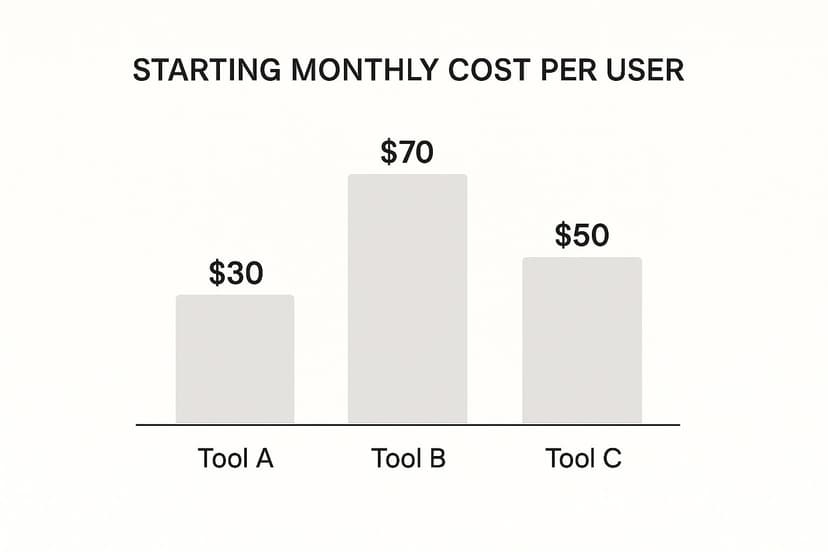
As you can see, Power BI offers the most accessible entry point on price, with Looker often representing a more significant investment, and Tableau sitting comfortably in the middle.
Core Feature and Usability Showdown
To pull this all together, let’s look at a direct side-by-side comparison. This table distills the user experience and key functionalities, highlighting where each tool really shines and for whom.
| Criterion | Microsoft Power BI | Tableau | Looker (Google) |
|---|---|---|---|
| Primary User Experience | Excel-like, structured interface with a familiar ribbon menu. | Free-form, visual drag-and-drop canvas for creative exploration. | Web-based, model-driven interface focused on governed exploration. |
| Learning Curve | Low for basic reporting; High for mastering DAX and advanced modeling. | Moderate; easy to start visualizing, but advanced features require practice. | High for developers (LookML); Low for business users exploring data. |
| Ideal User Persona | Business analysts and general users comfortable with the Microsoft ecosystem. | Data analysts, scientists, and anyone focused on deep data storytelling. | Data engineers and analysts building a governed platform for business users. |
| Dashboard Flexibility | Good, with a vast library of standard and custom visuals. | Excellent, offering unparalleled control over visual design and interactivity. | Good, but visuals are constrained by the underlying LookML model for consistency. |
This view makes the trade-offs crystal clear. Power BI's strength is its incredibly low barrier to entry for millions of people who already know Excel. Tableau's edge is its best-in-class visual analytics depth. And Looker's core value is its ability to build a scalable, trustworthy data culture through its powerful semantic layer. The right choice depends entirely on which of these priorities best matches what your organization needs to achieve.
Analyzing Data Integration and Connectivity
A business intelligence tool is only as good as the data it can actually reach. When you're comparing BI platforms, the ability to connect seamlessly to all your different data sources isn't just a feature—it's everything. This is where a platform's real power is either unleashed or completely held back, directly impacting how good and how fresh your insights are.
The strength of these connections comes down to two things: the number of built-in connectors available and how much you can tweak them. Let’s break down how Microsoft Power BI, Tableau, and Looker each tackle this, because their approaches are built for very different types of businesses.

Native Connectors and Ecosystem Alignment
The simplest way to get your data flowing is always with a pre-built, native connector. These are designed to work right out of the box with minimal fuss, connecting everything from SQL databases to popular SaaS apps.
-
Microsoft Power BI is the clear winner for any organization already deep in the Microsoft world. It offers practically one-click connections to Azure services like Azure Synapse Analytics, Azure SQL Database, and Microsoft Fabric. Its tight integration with Office 365 and Dynamics 365 makes it a no-brainer for companies that run on Microsoft.
-
Tableau prides itself on having one of the most extensive libraries of native connectors out there, covering a massive range of databases, cloud warehouses, and applications. This vendor-neutral stance makes it incredibly flexible for organizations running a mix of on-prem, hybrid, or multi-cloud data systems. It doesn't matter if your data lives in Snowflake, Redshift, or a humble Google Sheet; Tableau probably has a connector for it.
-
Looker, now part of Google Cloud, offers unmatched integration with the GCP ecosystem, especially BigQuery. Its whole architecture is designed to tap into the raw power of modern cloud data warehouses directly. While it connects to plenty of other sources, Looker truly sings when it’s pointed at a massive, scalable SQL database in the cloud.
Live Connections Versus Data Extracts
Beyond just making the connection, how a tool accesses data has a huge impact on performance and how current your information is. The choice between a live connection and a data extract is a fundamental one.
A live connection queries your source database in real time. Every time someone filters a dashboard or drills into a chart, the BI tool sends a fresh query to the database. This is perfect for things like operational dashboards where you need to see what's happening right now.
An imported data extract, on the other hand, pulls a copy of the data into the BI tool's own high-speed, in-memory engine. These extracts can be refreshed on a schedule, like every hour or once a day. This usually results in much faster dashboard performance because queries are hitting an optimized, local dataset.
The choice between live and extract is a classic trade-off. Live connections give you immediate data but depend heavily on your database's performance. Extracts give you speed and take the load off your source systems, but you're always looking at data that's slightly out of date.
API Flexibility and Custom Solutions
What happens when a native connector just doesn't exist? That’s when a powerful API becomes your best friend. A flexible API lets your developers build custom connections, embed charts into other applications, and automate all sorts of administrative work.
To really get a handle on what’s happening under the hood, this ultimate API integration tutorial provides a fantastic deep dive into the technical side of making different systems talk to each other.
Here’s a quick breakdown of how the tools compare:
| Integration Aspect | Microsoft Power BI | Tableau | Looker (Google) |
|---|---|---|---|
| Connection Strategy | Shines with both Import (VertiPaq engine) and DirectQuery (live), especially for Microsoft sources. | Extremely strong with both Extracts (Hyper engine) and Live connections to a vast array of sources. | Primarily uses a live connection model, querying the database directly for every single analysis. |
| API Capabilities | A solid REST API for embedding, automation, and management, but it's most at home within the Microsoft ecosystem. | Very extensive APIs for embedding analytics, managing data sources, and handling server administration. | A powerful, modern API where almost every function in the platform is a programmable endpoint. |
| Best Fit Scenario | Businesses standardized on Azure and Microsoft 365 looking for a great mix of performance and ease of use. | Companies with diverse, multi-vendor data sources that demand maximum flexibility in how they connect. | Data-forward organizations using a modern cloud data warehouse who need governed, real-time analytics. |
Understanding Pricing and Total Cost of Ownership
Cost is usually the final hurdle when choosing new software, and a real comparison of business intelligence tools has to go way beyond the sticker price. To understand the total cost of ownership (TCO), you need to break down how each platform charges for different users, what it means for your data infrastructure, and where the hidden fees are lurking. This is the only way to get an accurate forecast of what you'll actually spend.
The BI market is massive for a reason. Companies are on track to spend roughly USD 72.1 billion on BI software in the next year alone, and a whopping 43% of that comes from the Americas. This shows just how much value businesses place on getting solid, data-driven insights. If you want to dig deeper into these numbers, you can check out a full business intelligence market report.

Deconstructing Per-User Pricing Models
On the surface, most BI tools look like they have a simple per-user, per-month fee. The reality is much more complex, with different price tags for different kinds of users.
- Content Creators: Think of these as your analysts and developers—the people actually building the dashboards and data models. Their licenses are always the most expensive.
- Content Viewers: These are the business users who just need to see and interact with reports, not build them. Their licenses are much cheaper, designed to be rolled out to a lot of people.
For instance, Tableau breaks this down into "Creator," "Explorer," and "Viewer" roles, which lets you match your spending to how people actually use the tool. Microsoft Power BI keeps it a bit simpler with its Pro and Premium licenses. The Premium tier is based on capacity, which can be a game-changer for big companies with tons of viewers.
The key is to map your team’s roles to the licenses available. A common and expensive mistake is buying creator-level access for everyone, which can absolutely skyrocket your TCO.
Uncovering Hidden and Associated Costs
That monthly subscription fee is just the tip of the iceberg. Your true TCO is going to include a bunch of other costs that pop up depending on the platform you pick and the tech you already have.
Be on the lookout for these potential expenses:
- Data Gateways and Server Licenses: If you're pulling data from on-premise sources, you might need to buy and maintain gateway software or server licenses. That adds hardware costs and administrative work to your plate.
- Data Warehouse Costs: A tool like Looker (now part of Google Cloud) is only as fast as the database behind it. While Looker itself doesn't charge for data storage, its live-query approach means your bills from cloud data warehouses like BigQuery or Snowflake could climb as more people use it.
- Training and Implementation: The more complex the tool, the more it costs to get your team up to speed. Looker, with its powerful but steep-learning-curve LookML modeling layer, usually demands more specialized training for the data team compared to the get-started-quickly feel of Power BI.
A Practical Financial Breakdown
Let’s translate this into what it means for your wallet by comparing the financial philosophy of each tool.
| Platform | Pricing Philosophy & Ideal Scenario |
|---|---|
| Microsoft Power BI | Value-Driven Integration. This is your lowest entry point, hands down, especially if you're already in the Microsoft 365 and Azure ecosystem. The per-user Pro license is incredibly competitive for small and mid-sized teams. |
| Tableau | Role-Based Scalability. It gives you really granular, role-based licensing for maximum flexibility. Teams who want best-in-class visualizations and are willing to pay a premium for that power often land here. |
| Looker | Platform-Based Investment. This is typically the biggest upfront investment. Looker is priced as a platform with custom tiers built around your user count and scale, designed for data-mature companies aiming for a governed, scalable data culture. |
At the end of the day, the most cost-effective solution depends on your entire data ecosystem. Power BI offers incredible value if you’re a Microsoft shop, Tableau provides flexibility for more diverse tech stacks, and Looker is a serious investment in long-term, enterprise-grade data governance.
Which BI Tool Is Right for Your Business
Okay, you've seen the side-by-side comparisons. Now for the hard part: turning all that information into the right decision for your business. The best BI tool isn't the one with the longest feature list. It's the one that clicks with your team's skills, fits into your current tech stack, and actually helps you hit your goals.
Let's move past the spec sheets and talk about real-world scenarios. There’s no single "best" platform—only the best fit for the job at hand.
The Microsoft-Centric Enterprise
If your organization runs on the Microsoft ecosystem, Power BI is almost always the path of least resistance. For small to mid-sized businesses (SMBs) or large enterprises already deep into Office 365, Azure, and Dynamics 365, the integration is just seamless.
Think about a finance department that basically lives in Excel. The transition to Power BI is incredibly natural. The DAX language will feel familiar, and the interface won't be a huge shock, letting them build sophisticated financial models without having to relearn everything. Plus, its low-cost Pro license makes it a seriously accessible option without a huge budget commitment.
The Data Storytelling Team
When your main goal is to create compelling visual narratives and empower deep, exploratory analysis, Tableau is in a class of its own. Its drag-and-drop canvas is famously intuitive, encouraging users to play with the data and stumble upon insights that more rigid tools might hide.
Picture a marketing team trying to untangle their campaign ROI across a dozen different channels. They're pulling data from Google Analytics, paid social, and their CRM. Tableau shines here, connecting to all those disparate sources and giving the team the visual flexibility to build a story that shows not just what happened, but why.
The choice often boils down to this: Power BI excels at making BI accessible and integrated across an organization, while Tableau is built for empowering deep, creative data exploration by analysts.
The Governed, Data-Mature Organization
For companies that have reached a certain level of data maturity and need a scalable, single source of truth, Looker (now part of Google Cloud) is the front-runner. Its secret sauce is the LookML modeling layer, which establishes a governed data framework and ensures everyone is speaking the same language.
This is a game-changer for an e-commerce business with siloed teams for sales, inventory, and customer support. By defining all the business logic—like what "customer lifetime value" actually means—in LookML, the CEO and a support agent are guaranteed to see the same number. This destroys data silos and builds real trust in the analytics. To get the most out of a system like this, it pays to follow some established business intelligence best practices from the start.
Ultimately, your choice depends entirely on your primary use case. Are you trying to give basic reporting tools to everyone? Do you need to empower a small team of expert analysts? Or are you building a long-term, governed data culture? Answering that question will lead you straight to the right tool.
Common Questions About BI Tools
Choosing a BI tool always brings up a few practical questions beyond just features and pricing. Let's tackle some of the most common ones that come up when teams are trying to make that final decision.
These are the details that often make or break a successful BI rollout.
How Long Does It Take to Implement a BI Tool?
The timeline for getting a BI tool up and running can be anywhere from a few weeks to several months. It really depends on the tool you choose and the state of your data.
For example, a straightforward Power BI setup pulling from a couple of well-organized spreadsheets might only take a few weeks. On the other end of the spectrum, a company-wide Looker implementation with a complex, custom LookML model could easily stretch over six months.
The biggest variables are:
- Data Readiness: How clean and structured is your data right now?
- Team Skillset: Do you have people who know their way around data engineering and analytics?
- Scope of Deployment: How many people, dashboards, and data sources are you trying to connect?
A classic mistake is to focus only on the tool itself. In reality, about 80% of the work in any BI project is spent cleaning, shaping, and modeling your data before it ever gets visualized.
On-Premise vs. Cloud BI: Which Is Better?
The on-premise versus cloud debate boils down to your company's specific needs around security, budget, and IT resources.
These days, cloud-based (SaaS) BI platforms like Power BI Service, Tableau Cloud, and Looker are the default choice for most organizations. They’re easier on the wallet upfront, you don't have to worry about updates, and they can scale with you. It’s no surprise that most new BI projects are cloud-based.
On-premise solutions still have their place, though. They give you complete control over your data, which is non-negotiable for organizations in finance or healthcare with strict compliance rules. Just be prepared for the hefty investment in hardware and the need for a dedicated IT team to keep everything running.
Ready to supercharge your data analysis without leaving your favorite spreadsheet program? Elyx.AI is an AI-powered Excel add-in that lets you clean, analyze, and translate your data using simple, natural language prompts. Ask questions, generate insights, and build complex formulas instantly. Try Elyx.AI and see how easy data analysis can be. Learn more at the official Elyx.AI website.
Reading Excel tutorials to save time?
What if an AI did the work for you?
Describe what you need, Elyx executes it in Excel.
Sign up