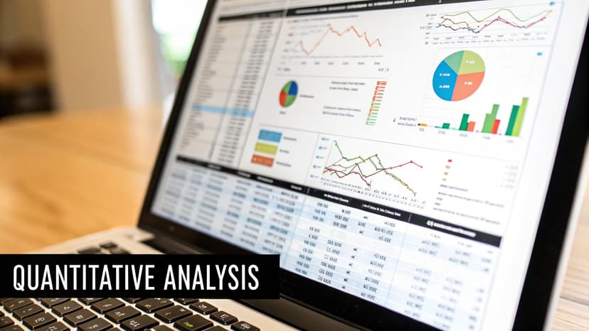
Unlocking Insights with Trend Analysis Methods in Excel

Trend analysis methods are statistical tools that help you spot patterns, seasonal shifts, and the general direction your data is headed over time. By using core techniques like Moving Averages and Regression Analysis directly in Excel, businesses can analyze past performance to get a solid idea of what's coming next, turning old data into an actionable roadmap for the future.
Why Trend Analysis Is Your Business Superpower
Ever tried to navigate a ship across the ocean without a map or a compass? You might get lucky, but you're far more likely to drift aimlessly, burn through supplies, and end up miles from where you wanted to go. Running a business without understanding the direction of your data is pretty much the same gamble.
Trend analysis is the skill of charting your business’s course by looking at where it's been. It’s a way to turn a jumble of raw numbers in your spreadsheet into a clear story about your performance. Think of yourself as that ship captain, using logs from past voyages to plot a smarter, faster route for the future.
Spending too much time on Excel?
Elyx AI generates your formulas and automates your tasks in seconds.
Sign up →This guide will walk you through the most important trend analysis methods you can use right inside Excel. We’ll solve the concrete problem of forecasting and understanding business performance by focusing on two powerful techniques:
- Moving Averages: This is your go-to for smoothing out noisy data. It helps you see the real, underlying trend in things like monthly sales or website traffic, ignoring the random daily spikes and dips that can be misleading.
- Regression Analysis: This technique is perfect for connecting the dots between two different variables. For instance, you can use it in Excel to see exactly how much your marketing spend is affecting your revenue, or how a price change impacts customer demand.
Not too long ago, doing this kind of analysis meant you needed a solid background in statistics and a lot of patience for manual calculations. Thankfully, those days are over.
With AI tools like Elyx.AI now working inside Excel, complex trend analysis isn't just for data scientists anymore. Anyone can ask a simple question in plain English and get back instant insights, charts, and forecasts without leaving their spreadsheet.
This is a huge shift. It means you can finally move past making decisions based on gut feelings and start backing them up with real evidence from your own data. By the time you finish this article, you’ll have the skills to forecast sales, measure your marketing efforts, and plan for the future with a lot more confidence.
Building Your Foundation with Historical Data

Every solid forecast starts with a look in the rearview mirror. Before you can even think about using powerful trend analysis methods, you need a strong foundation, and that foundation is your historical data in Excel. It’s a bit like a detective showing up at a crime scene; you don't start making wild guesses until you've gathered all the clues. In business, your historical data provides the clues that reveal past behaviors and patterns shaping your future.
Think about a retailer gearing up for the holiday rush. They don't just guess how much inventory to order. They dig into sales figures from the past five years in their spreadsheets to see which products flew off the shelves, pinpoint exactly when the buying frenzy began, and figure out how much stock they really needed. This backward glance is what empowers them to make a much smarter bet on what's to come.
The Critical Role of Data Quality
You’ve probably heard the old saying, "garbage in, garbage out," and in data analysis, it's the absolute truth. If you build your analysis on flawed data, your conclusions will be just as shaky. So, before you jump into any forecasting in Excel, you have to make sure your dataset is clean, complete, and relevant to the question you're asking.
High-quality data is the difference between looking at a blurry, distorted photo and a crystal-clear image. Without it, you could easily mistake a one-off fluke for a genuine trend or completely miss a seasonal pattern buried under messy entries.
A key part of building a robust foundation for trend analysis involves knowing where to find relevant historical data. For instance, you might consult professional resources to see how experts gather and structure historical performance data for predictive purposes.
Preparing Your Dataset in Excel
Once you've got the data in your spreadsheet, it's time to roll up your sleeves and prep it for analysis. The goal here is to whip your information into a shape that’s both trustworthy and easy to work with.
Here are three practical steps you can take right inside Excel:
- Handle Missing Values: Empty cells can throw a wrench in your calculations. You need a consistent game plan, whether that means filling the gap with an average, a zero, or another value that makes sense in context. Excel's
IFandISBLANKfunctions can help automate this. - Spot and Address Outliers: An outlier is a data point that sticks out like a sore thumb—think of a massive, one-day sales spike from a viral social media post. These can seriously skew your results, so you have to decide whether to remove them (using filters) or dig deeper to understand what caused them.
- Ensure Consistent Formatting: A quick scan for consistency in dates, numbers, and text can save you a lot of headaches. Use Excel's "Format Painter" or "Text to Columns" features to standardize your data so your charts and formulas work correctly.
Make no mistake, historical data is the backbone of forecasting. In fact, a 2023 survey found that about 85% of Fortune 500 companies use historical trend analysis to inform their strategic planning. They rely on the past to get a clearer picture of the future.
Smoothing Out the Noise with Moving Averages
Real-world data is rarely a smooth, clean line. If you've ever plotted daily website visits or monthly sales in Excel, you know the chart often looks like a chaotic series of spikes and dips. This "noise" can make it tough to see the bigger picture. Are you actually growing, or was last week just a lucky fluke? This is exactly the problem moving averages were designed to solve.
Think of a moving average as a way to iron out a crumpled piece of paper so you can finally read what’s written on it. It’s one of the most fundamental trend analysis methods because it cuts through the distracting short-term volatility, revealing the true direction your data is heading.
Simple vs. Exponential Moving Averages
You'll mainly run into two types of moving averages in Excel. Each serves a different purpose, and knowing the difference is key to getting your analysis right.
-
Simple Moving Average (SMA): This is the straightforward one. It calculates the average of a set number of past data points. For instance, a 7-day SMA of website traffic just averages the visits from the last seven days. It gives equal importance to all data in that window, which makes it great for spotting long-term, stable trends.
-
Exponential Moving Average (EMA): This one is a bit more sophisticated and responsive. The EMA also calculates an average, but it gives more weight to the most recent data points. This makes it much better for spotting newer trends or recent shifts in momentum because it reacts to changes more quickly.
The following screenshot shows how a 12-month Simple Moving Average (SMA) can transform messy monthly sales data in Excel. It smooths out all the volatile ups and downs into a clear upward trendline.
The blue line, representing the actual monthly sales, jumps all over the place. But the orange line—the moving average—tells a different story, revealing a consistent and positive growth path that was otherwise hidden by all that noise.
Calculating Moving Averages in Excel
You can calculate a Simple Moving Average in Excel yourself using the AVERAGE function. For example, if you have monthly sales in column B (starting from B2), you could find the 3-month moving average in cell C4 by typing the formula =AVERAGE(B2:B4) and then dragging it down the column.
Honestly, though, this manual approach gets old fast, especially with large datasets. It's easy to make a mistake. This is where a good AI tool can really change the game.
With an AI add-in like Elyx.AI, you can just highlight your data and type a simple command like, "Create a line chart for monthly sales and add a 3-month moving average." The tool instantly handles all the calculations and builds the chart for you. No formulas, no fuss—just a professional-looking chart in seconds.
This doesn't just save time; it ensures you get it right, letting you focus on what the trend actually means instead of wrestling with your spreadsheet. Moving averages are a cornerstone of analysis for a reason. Market research shows that over 60% of technical analysts rely on them, and they can improve demand forecasting accuracy by 10%-15%. You can dig deeper into these trend analysis techniques on zappi.io. By automating this proven method, you bring a powerful analytical tool right into your daily Excel workflow.
Finding Relationships with Regression Analysis
While moving averages are great for spotting the general direction of a single metric, they don't tell you the why. Business results aren't just random occurrences; they're often driven by specific factors. This is where regression analysis comes in—it’s the tool that helps you connect those dots right within Excel.
Think of yourself as a data detective. You suspect that pumping more money into your marketing budget is driving up sales, but how can you be sure? Regression analysis lets you measure that relationship and answer the all-important question: "If I change X, what will happen to Y?"
Understanding the Key Metrics
When you run a regression in Excel, you'll see a lot of stats, but one number tells most of the story: R-squared. It's a value between 0 and 1 that explains how much of the movement in one variable is caused by the movement in another.
- An R-squared of 0.85 is a strong signal. It means 85% of the change in your sales can be explained by your marketing budget.
- An R-squared of 0.15, on the other hand, suggests only 15% of your sales are tied to marketing spend. Something else is clearly the main driver.
This single metric turns your business hunches into solid, evidence-based insights.
How to Perform Regression Analysis in Excel
Excel has a couple of built-in ways to run a basic linear regression. You could use the Analysis ToolPak add-in for a full statistical report, or you can get a quick answer by adding a trendline to a scatter plot.
Here’s a practical, step-by-step example to check the link between a marketing budget and sales:
- Organize your data with two columns: "Marketing Spend" (X-axis) and "Sales" (Y-axis).
- Select both columns of data.
- Go to the "Insert" tab and choose a "Scatter" chart.
- Right-click on any data point on the chart and choose "Add Trendline."
- In the format pane that appears, tick the boxes for "Display Equation on chart" and "Display R-squared value on chart."
This gives you an immediate visual and statistical snapshot of the relationship. But for managers who need answers now without clicking through menus, there’s an even faster way.
AI tools like Elyx.AI turn this advanced analysis into a simple request. You can just highlight your data and type, “Run a regression analysis on marketing spend and sales, then summarize the findings and create a chart.”
The AI assistant handles all the heavy lifting—running the analysis, interpreting the R-squared value, and building a professional chart. It makes this powerful technique accessible to anyone, no stats degree required.
Choosing the Right Trend Analysis Method
So, you've got a handle on Moving Averages and Regression Analysis. Now for the million-dollar question: which one should you actually use in Excel? Getting this right is crucial. It’s the difference between finding a crystal-clear, actionable insight and just staring at a confusing chart.
The choice isn't about which method is inherently "better." It’s about picking the right tool for the job, based on the question you're trying to answer and the data you have.
Think of it like this: a telescope is great for spotting constellations, but you'd never use it to examine a cell. A Moving Average is your telescope—perfect for seeing the big picture, like the overall direction of your sales over the last year. Regression Analysis is your microscope. It lets you zoom in on the details, like how a $5 price cut impacted your weekly sales figures.
Comparing Key Trend Analysis Methods
The main difference really boils down to your goal. Are you just trying to see the momentum of a single metric, or do you need to understand how different factors relate to each other?
-
Use Moving Averages when: You want to smooth out the noise and see the underlying trend of one specific thing. It’s perfect for answering questions like, "Is our website traffic generally heading up or down?" or "What’s the long-term trend for our monthly active users?"
-
Use Regression Analysis when: You’re digging for a cause-and-effect relationship. This is the tool for questions like, "How much does our ad spend actually affect lead generation?" or "Can we predict next quarter's sales based on seasonality?"
This chart can help you visualize which path to take depending on what you're trying to achieve.
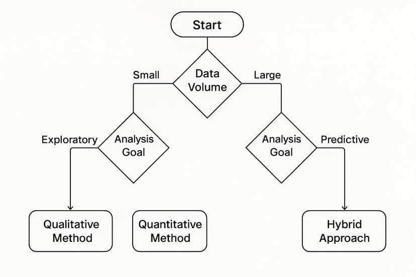
As you can see, your goal—whether it’s just exploring the data or making a specific prediction—is the biggest factor in choosing the right approach.
Making the Decision in Excel
Let's bring this down to earth with a simple Excel scenario. Picture a spreadsheet with two columns: "Month" and "Sales Revenue."
If your boss asks, "Give me the big-picture sales trend for the past two years, and ignore all the random monthly spikes and dips," a Moving Average is your go-to. It will draw a nice, smooth line that shows the general trajectory.
But what if the question is, "We poured money into that Q3 marketing campaign. Did it actually move the needle on sales?" For that, you need Regression Analysis. It can help you quantify the relationship between your campaign spend (another variable) and your sales numbers, giving you a much deeper and more powerful insight.
To make it even clearer, here’s a side-by-side look at the two methods.
Choosing Your Method: Moving Averages vs. Regression Analysis
This table breaks down the core differences to help you decide which technique fits your needs.
| Feature | Moving Averages | Regression Analysis |
|---|---|---|
| Primary Goal | Smooth out data to see the general direction of a single trend. | Understand and quantify the relationship between two or more variables. |
| Best For | Visualizing long-term momentum and filtering out "noise." | Forecasting, prediction, and identifying cause-and-effect links. |
| Data Requirements | A single time-series dataset (e.g., sales over time). | Two or more variables (e.g., ad spend and sales revenue). |
| Question It Answers | "What is happening?" | "Why is it happening?" |
| Example | "Are our monthly active users on an upward or downward trend?" | "How does a price change of $10 affect our product sales?" |
| Complexity | Simple to calculate and interpret. | More complex, requires a better understanding of statistics. |
| Output | A smoothed line chart showing the trend. | A formula (like y = mx + b) that defines the relationship. |
Ultimately, picking the right analysis method comes down to matching the tool to your objective.
Moving Averages are fantastic for clarifying the 'what'—the direction a trend is heading. Regression Analysis is all about explaining the 'why'—the factors that are actually driving that trend.
By understanding this fundamental difference, you can confidently choose the most effective trend analysis method for any business problem and make sure your work in Excel delivers real, strategic value.
Putting Your Trend Analysis Skills to Work
Theory is great, but getting real results is what actually counts. This is where we bring it all together. Let's walk through some real-world business scenarios where you can apply these trend analysis methods today, right inside Excel. We’ll look at how different teams can use historical data to make smarter, forward-looking decisions.
A finance team, for instance, needs to forecast quarterly revenue. They have years of sales data. By applying regression analysis, they can finally see a clear connection between things like marketing spend or seasonal rushes and the company's bottom line. An AI tool can run multiple "what-if" scenarios in a flash, showing exactly what revenue might look like with different budget choices.
Practical Applications Across Departments
Let's see how other teams can put these techniques to good use. Each of these examples tackles a common business problem and shows how trend analysis offers a clear way forward.
A marketing team wants to know if their latest social media campaign was a hit. They have daily numbers for likes, shares, and comments in an Excel sheet. A moving average is the perfect tool here. It smooths out the daily noise and reveals the real engagement trend, answering the big question: "Did we build lasting buzz, or just create a few temporary spikes?"
An operations manager is staring down the challenge of ordering the right amount of inventory. By looking at sales data from the last three holiday seasons, they can use regression analysis to forecast demand. This is how you make sure the shelves are stocked with what customers want without tying up cash in products that just sit there.
Trend analysis isn't new. As a formal method, it goes back to the early 20th century. Classic techniques like Time Series Analysis—looking at data points collected over time—became the standard for spotting patterns. Later, more advanced models were developed to understand market swings, improving forecast accuracy by an average of 15%-20% compared to simpler methods. To learn more about this history, check out this guide on mastering trend analysis on sprinkledata.com.
Accelerating Insights with AI in Excel
In all of these situations, having AI built into Excel is a massive shortcut. Instead of wrestling with formulas and manually building charts for hours, you can just type what you need.
Imagine asking your AI assistant: "Forecast our Q4 revenue based on the last three years of sales data and our planned marketing budget." Seconds later, you have a full report and a chart ready to go. Suddenly, you're the data expert on the team. This kind of quick visualization is a game-changer. And if you want to make those charts even better, you might be interested in our guide on data visualization best practices.
For a deeper dive into the strategies behind interpreting market data, you can explore guides that explain how to analyze market trends.
Frequently Asked Questions

Let's dig into some of the most common questions people ask when they're first diving into trend analysis methods in Excel. Getting these basics down will give you the confidence you need to start exploring your own data.
How Much Historical Data Do I Need for Accurate Trend Analysis?
There’s no one-size-fits-all answer here—it really hinges on the kind of trend you’re trying to spot.
If you're hunting for seasonal patterns, like a bump in sales every holiday season, you need enough data to see that cycle repeat. A good rule of thumb is having two to three full cycles of data. So, for quarterly sales trends, you'd want somewhere between 8 and 12 quarters of information to be confident in what you're seeing.
For broader, long-term trends, a few years of data is usually best. While AI tools can work with less, having at least 25 data points gives you a much more reliable foundation. Honestly, more data is almost always better.
Can I Combine Different Trend Analysis Methods?
Yes, and you absolutely should! Think of it like using different tools to build something. Combining methods often gives you a much clearer, more complete picture of what's happening in your data.
For example, you could start with a moving average to smooth out the random noise in your monthly sales data. That makes the underlying long-term trend easier to see. From there, you could apply regression analysis to figure out how specific things, like a marketing campaign or a price drop, affected that overall trend. It's a powerful way to get a much deeper story from your numbers.
What Is the Biggest Mistake People Make with Trend Analysis in Excel?
The most common pitfall is trusting a trendline completely without thinking about the real world behind the data. A trend shows you what has happened, but it’s not a crystal ball for what will happen.
It’s so important to consider outside factors. Is a new competitor about to launch? Is the economy shifting? A trend line can't know those things. Always treat your analysis as one part of a bigger puzzle, not the final answer. The other classic mistake is starting with messy, inaccurate data—if your input is garbage, your output will be too.
Ready to stop wrestling with formulas and start getting instant insights? With Elyx.AI, you can perform complex trend analysis in Excel with simple text commands. Generate charts, run regressions, and build forecasts in seconds. Discover how much faster and smarter your data analysis can be at https://getelyxai.com.
Reading Excel tutorials to save time?
What if an AI did the work for you?
Describe what you need, Elyx executes it in Excel.
Sign up